Mobile Application • Duration: 1 Week (7th-14th of Mar’2021)
Mobile App Search and Sort
- Usability Research
- Wireframes
- UX / UI Design
- Prototype
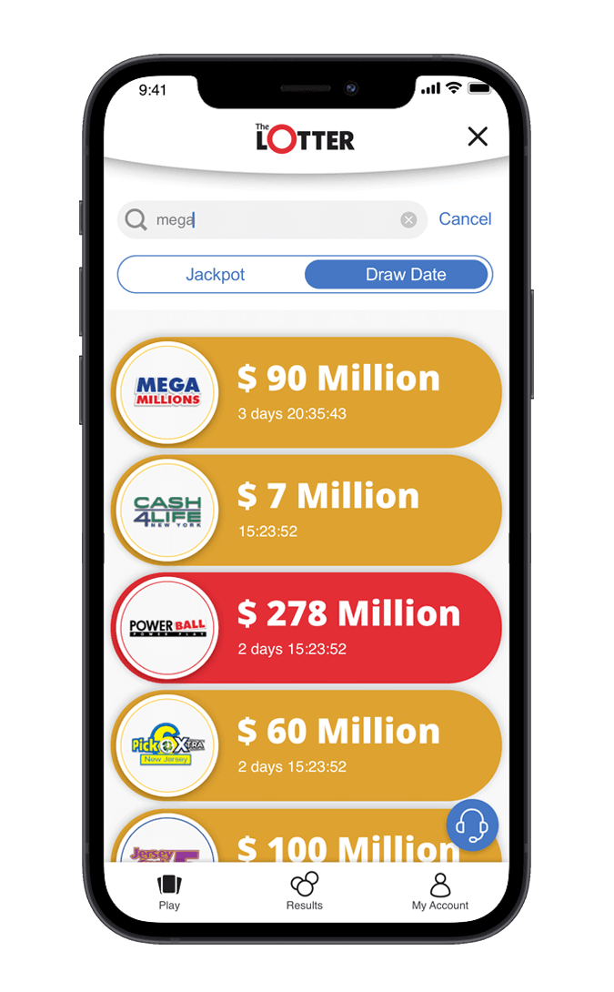
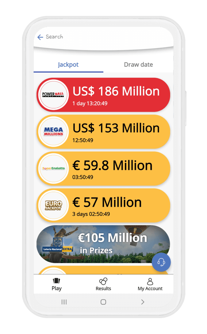
We got negative feedback during the last half year about theLotter’s new mobile application not having an option for sorting different lotteries as it had in the previous version of the application.
Objectives
- Adding a new sorting feature to our application
- Improving the search feature usability
- Making both features easy to find and accessible
Challenges
- I had only one week for this task, as I work in an Agile environment and the sprint was about to finish. I had to come up with good insights to ensure the design fitted the user needs.
- To use minimum real estate for this feature, as requested by the Head of Product.
Teams
I communicated with the Head of Product and Head of Customer Support
4 Steps Process
1. Research
Implementation and Best Practices
Short background
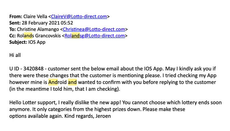
In July 2020, theLotter launched a new version of the app (for iOS and Android) with brand new UX, including improved bottom navigation so it would be easy to navigate between the main pages and UI that represent our brand. About 6 months later, our customer support agents started receiving emails from customers. They expressed disappointment that there was no option for sort the different lotteries, and that the only sorting was by default high to low jackpots.
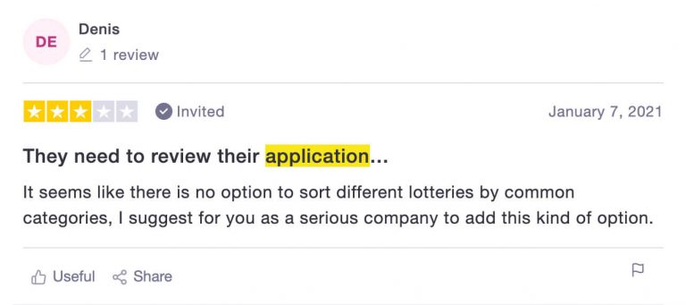
In addition to those emails, we noticed some negative feedback about sorting on TrustPilot. So, I was given the task to improve usability of the existing search and add sorting options (default by jackpot and the second category – closing soon).
Intuitive for the user
Firstly, I wanted to come up with a solution for making the feature easy to find and accessible, which means it should
be intuitive for the user.
What does is mean?
An intuitive design subtly conveys its meaning at the same time staring the user in the face, quite literally. It is so symbolically evident that the user cannot and must not think of anything else, other than the intended use of the feature. It must engender 3 of the following characteristics to be considered instinctive:
Discoverability
From the menu bars to the profile sections, you can explore everything within a click-or-two without losing your way. As many clicks as you are adding, it makes more affordance and the user might be drop off.
Affordnace
Intuitive UI uses a barrage of visual cues to tell the user what would be the result of clicking a button. Its elements keep in mind what the user wants/expects from a button. This brings me to the 3rd point.
Expectations
The user should be complemented by visual cues. A bell commonly denotes a notification, in our case magnify and listing means search and sort, etc. Intuitive UI design integrates a diaspora of icons that appeal to common sense.
As Jakob’s Law says: “Users spend most of their time on other sites. This means that users prefer your site to work the same way as all the other sites they already know.”
Having those 3 golden rules in mind, I proceeded to the next step of the research phase, which is best practices
Separate Them
Reddit, Asos, Kayak, and our biggest competitor (Lottoland) are true believers in separating these two features.
- Pros – The user sees those two features immediately.
- Cons – Most of the applications don’t allow sorting within the search.
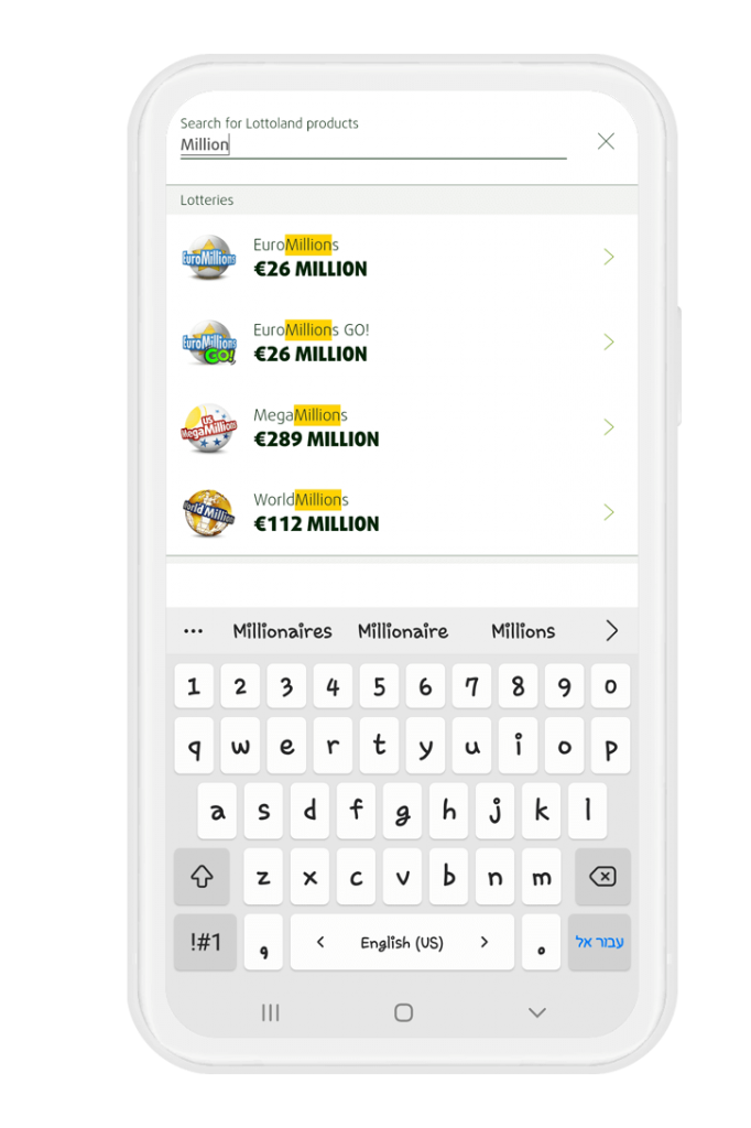
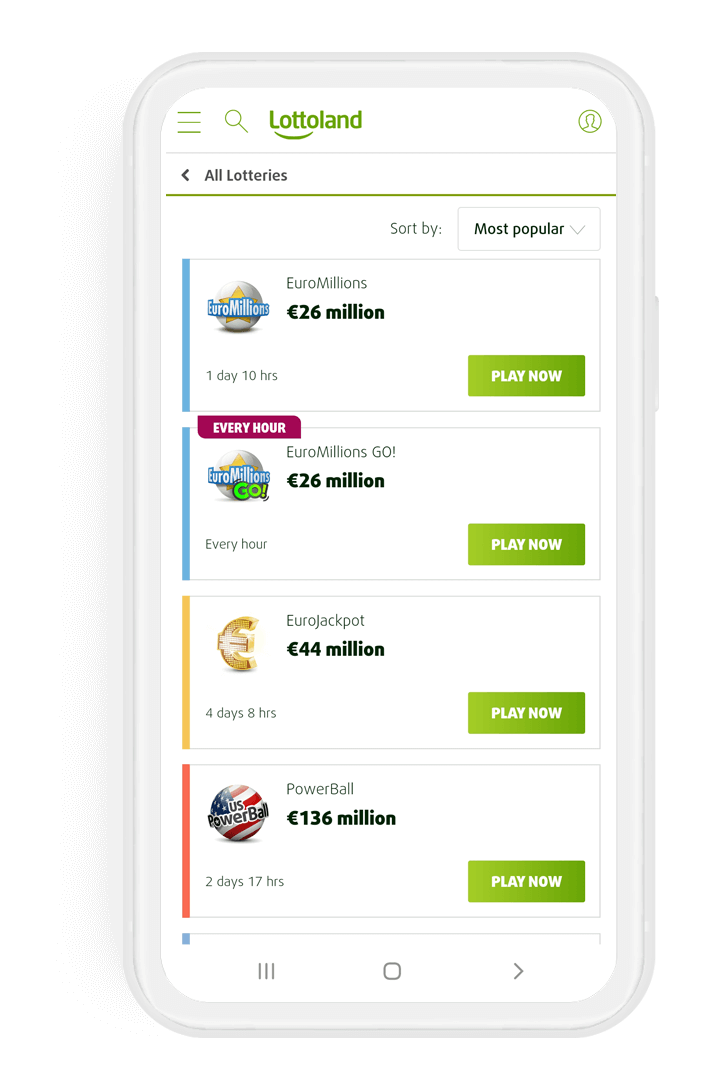
The user is allowed to sort games or search any games he wants but because each feature is independent, the user can't sort within the search.
Merging them
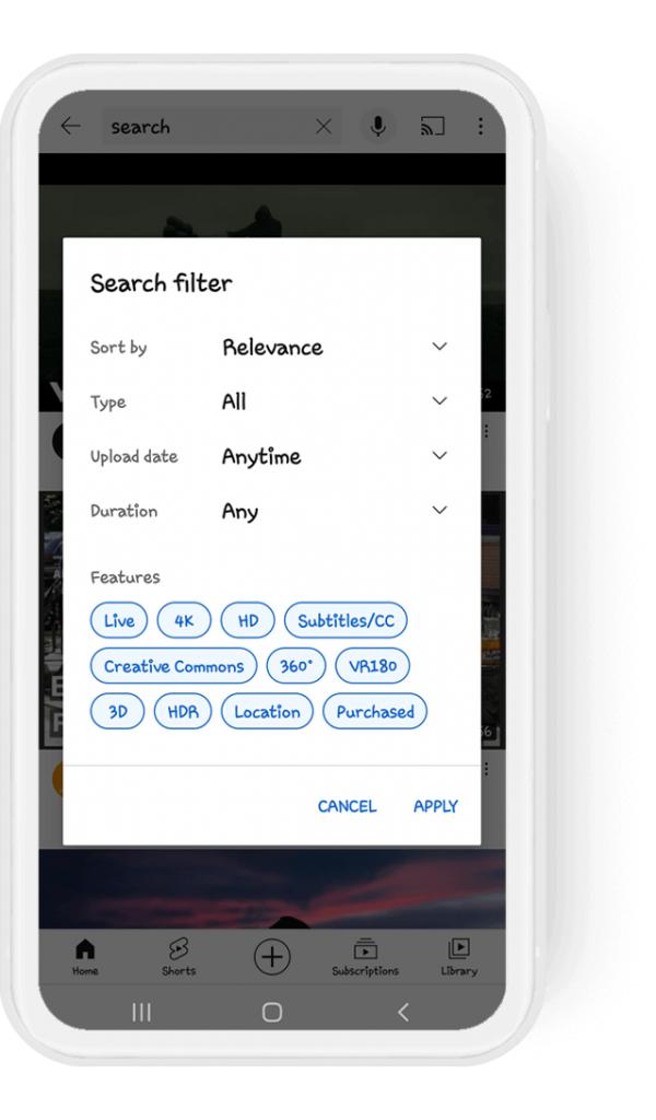
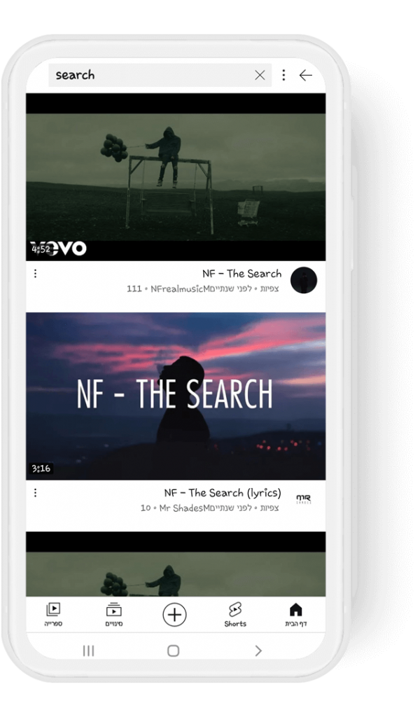
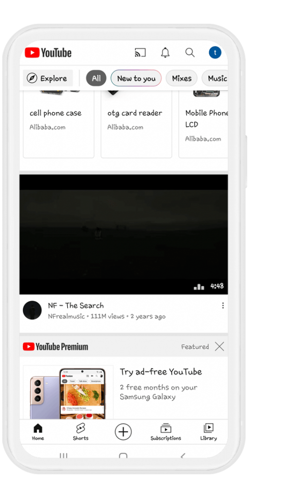
Some of the big brands use this approach (Google, eBay, etc..), in order to sort, you have to search for a product first.
- Pros – Saving real estate, the user could see more items at once.
- Cons – Sometimes very complex and looks like mission impossible to find the sorting option.
I want to take a closer look at the cons for a moment. Sometimes we hear peers from the company saying “Google/Facebook is implementing this method so it must be good”, but this is not always true.
Yes, they are doing some really great things and have super talented UX designers/product managers, but they are human after all, and they make mistakes. They have billions of users and they can afford to run as many A/B tests as they want. Those big brands know that even if the A/B test fails, their users are so emotionally connected to them, they won’t abandon them. BTW, the strongest engagement for users is to be emotionally connected. It’s hard to “break up” later.
Unlike intuitive research it looks like the user needs too many clicks to accomplish his task:
Click on search, Searching, Click on the "Kebab" menu, Click on Sort (4 clicks for sorting).
2. Wireframes
From paper to low fidelity wireframes
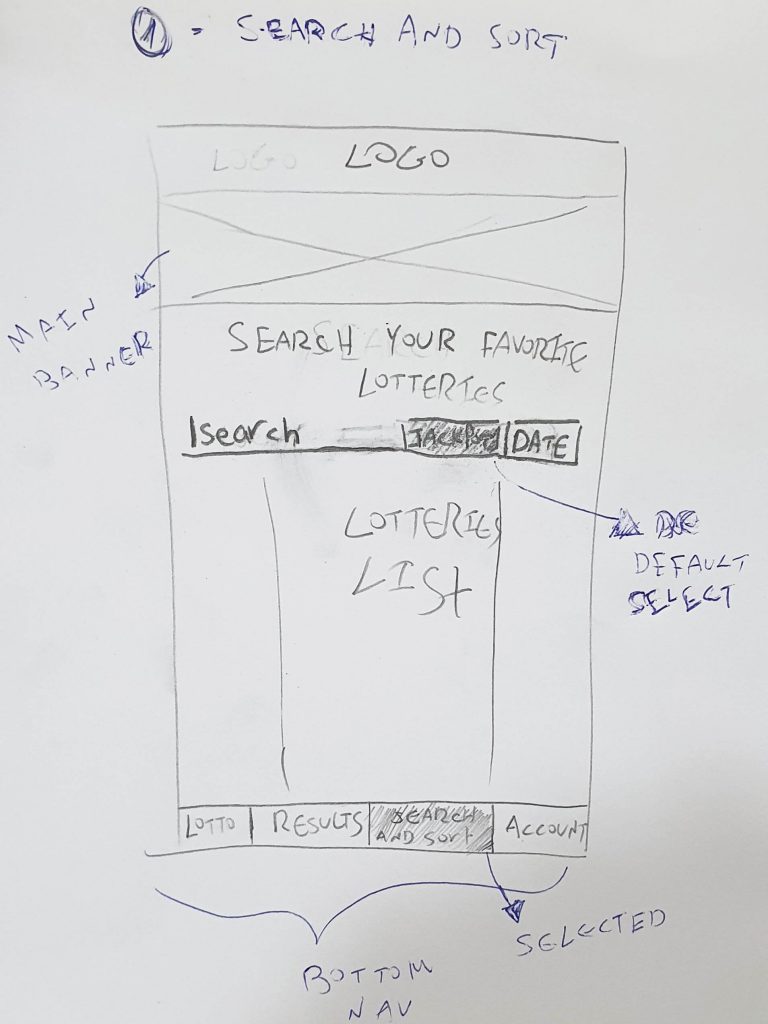
• Pros - We keep the same structure as we have today (with the search on the nav bar), adding sorting options.
• Cons - Less intuitive (too much clicks), needs to navigate to different page in order to use this feature.
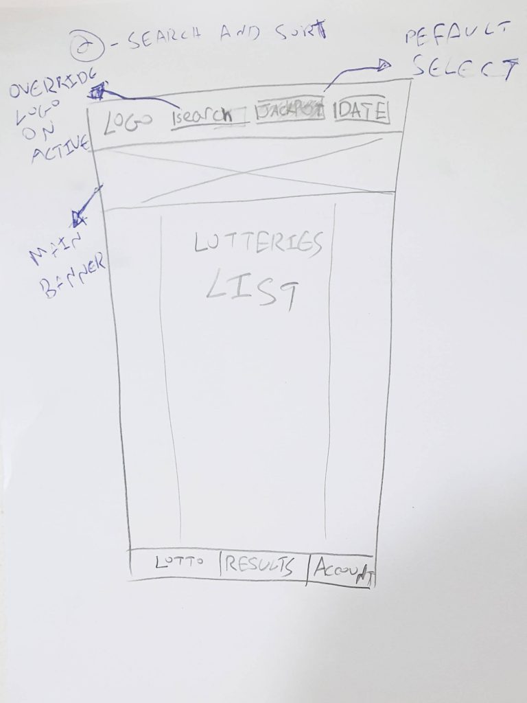
• Pros - Removing the search and sort from the navigation and placing it on the top is more intuitive, familiar from many apps.
• Cons - Requires new development and because the search and sorting tabs are closing to each other i'm afraid longer languages would cause issues.
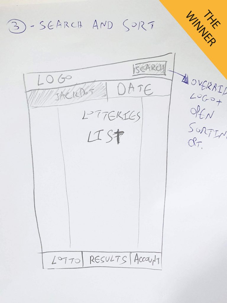
• Pros - Same as number 2, intuitive and best position for search and sort from many best practices. Sorting tabs fits good in all languages.
• Cons - Requires new development.
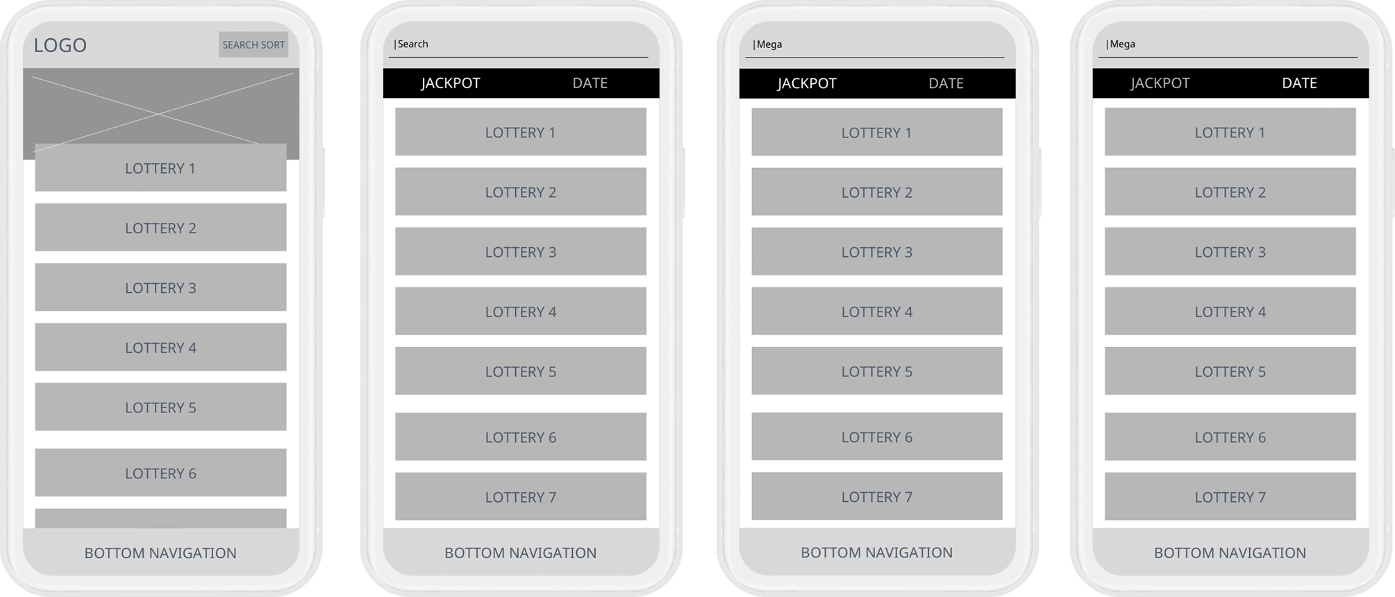
Low fidelity wireframes, based on the chosen sketch
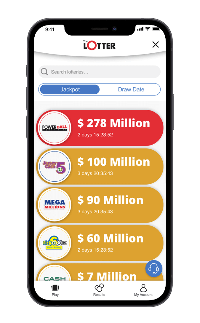
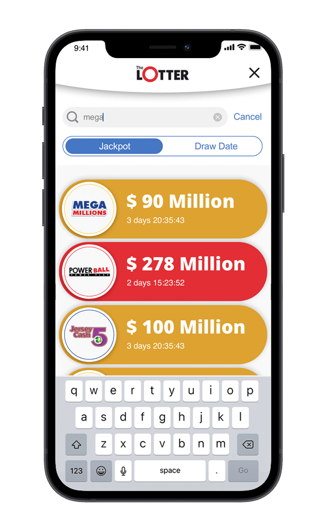
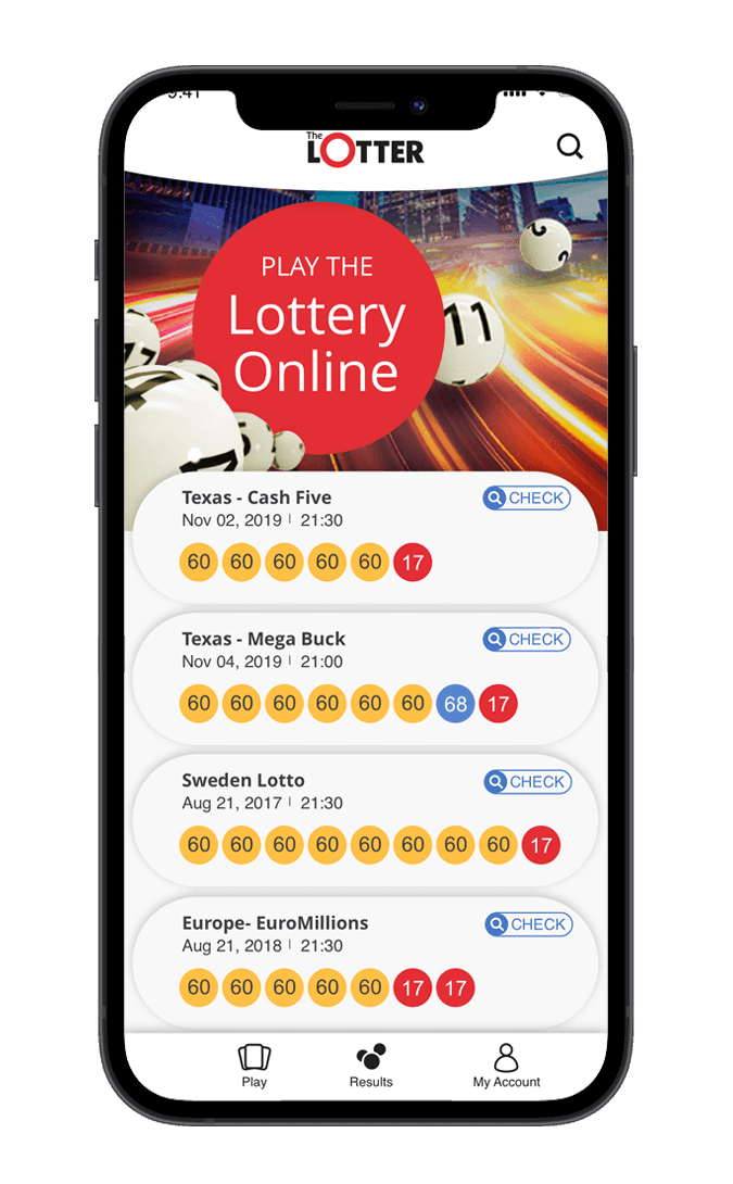
3. UI Design
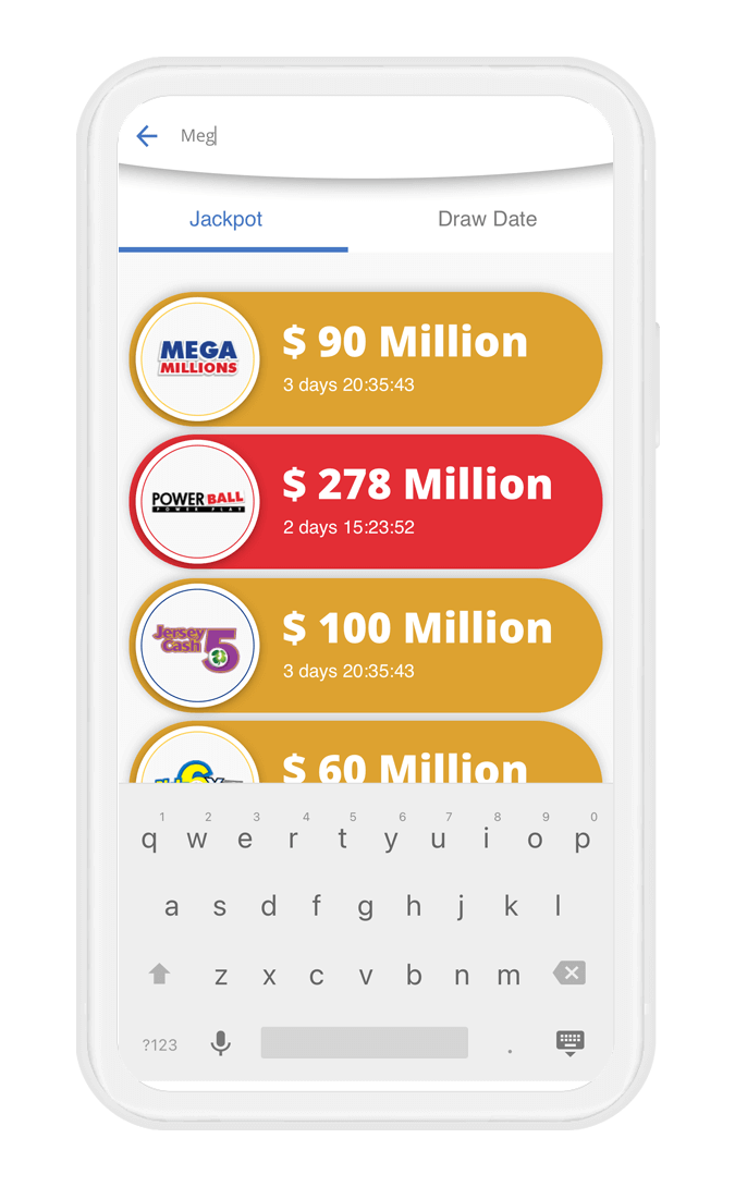
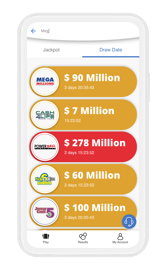
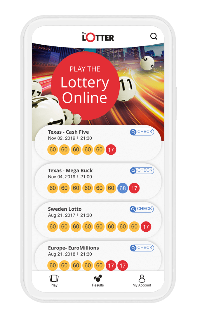
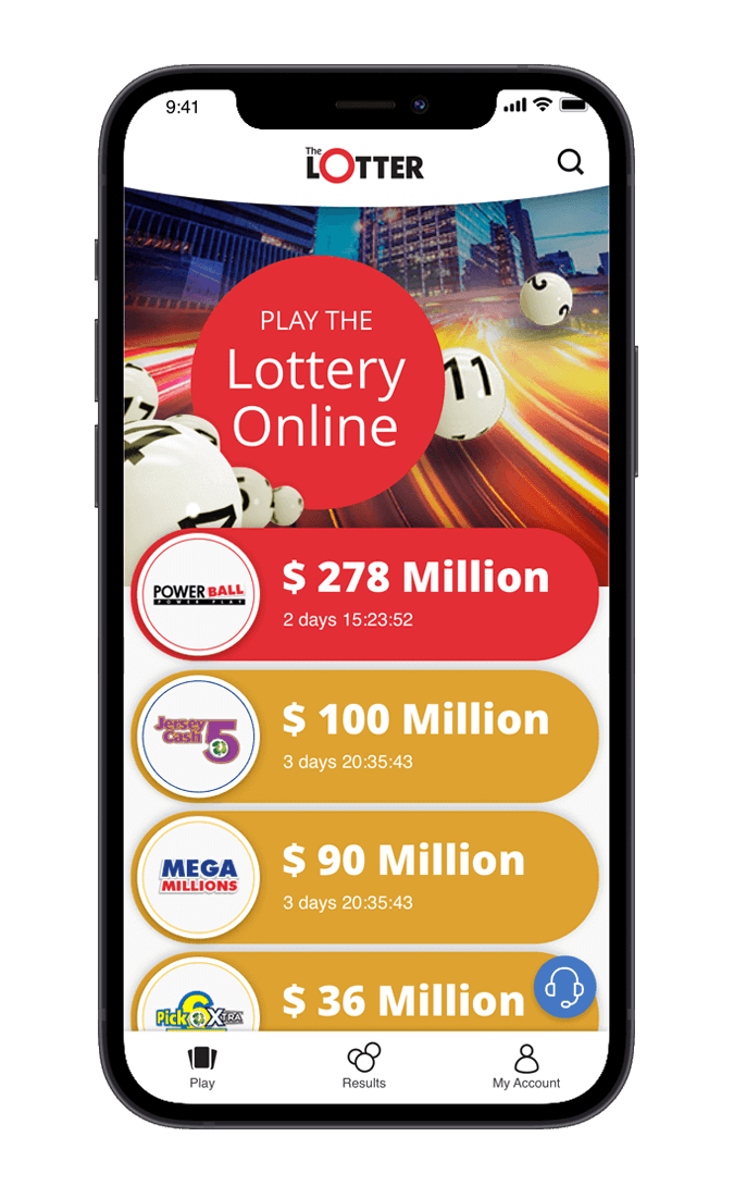
Now it’s time to create the visual based on Material Design and Apple (iOS Design)
for the different devices.
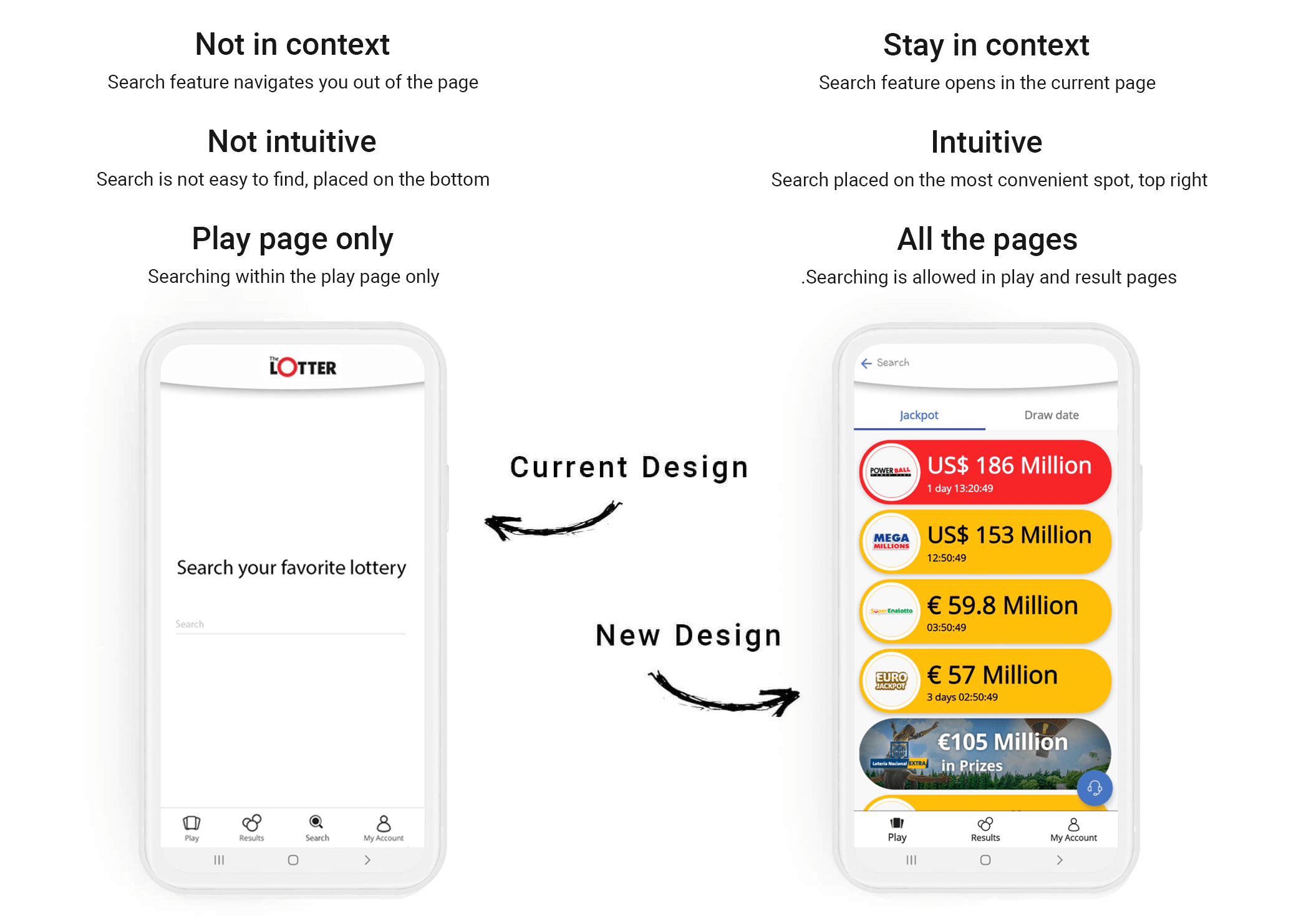
Android
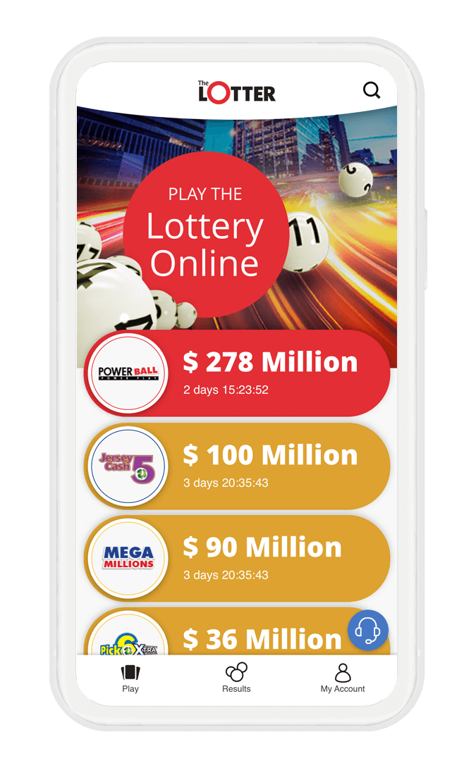
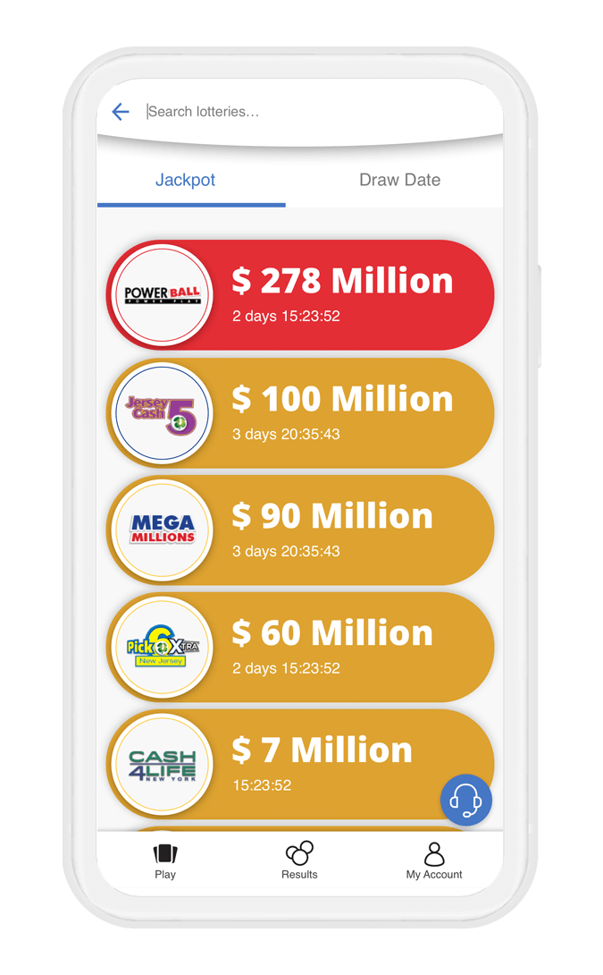
iOS

4. Prototype
While creating the prototype I also added a touch of micro-interactions
Thanks to the fact that I finished studying After Effect (Micro Interaction for UXer’s) a month before this project, I was able to add another layer of touch including nice micro-interaction when tapping on the search icon, even if no results are found.
Here is the final outcome:
Conclusion
- It’s very important to listen to your users. Thanks to the fact that we listened to our users, we were able to give our users a proper solution to their pain points and improve our product.
- Next time, when creating MVP for future products, it’s essential to follow the results in the first 6 months. This gives you plenty of time to make improvements and avoid users dropping off and leaving us for other competitors.
- After Effects gives another layer to improve from my end, and takes our product’s micro-interactions to the next level.
- As always, working in an Agile environment required me to be on track, read articles about best practices, and learn new approaches and methods.
Mobile Application • Duration: 1 Week (7th-14th of Mar’2021)
Search and Sort
- Usability Research
- Wireframes
- UX / UI Design
- Prototype

Objectives
- Adding a new sorting feature to our application
- Improving the search feature usability
- Making both features easy to find and accessible
Challenges
- I had only one week for this task, as I work in an Agile environment and the sprint was about to finish. I had to come up with good insights to ensure the design fitted the user needs.
- To use minimum real estate for this feature, as requested by the Head of Product.
Teams
I communicated with the Head of Product and Head of Customer Support
4 Steps Process




1. Research
Implementation and Best Practices
I initiated the process by reading articles about sorting, best practices, and how it should communicate with the search feature.
Short background
In July 2020, theLotter launched a new version of the app (for iOS and Android) with brand new UX, including improved bottom navigation so it would be easy to navigate between the main pages and UI that represent our brand. About 6 months later, our customer support agents started receiving emails from customers. They expressed disappointment that there was no option for sort the different lotteries, and that the only sorting was by default high to low jackpots.
In addition to those emails, we noticed some negative feedback about sorting on TrustPilot. So, I was given the task to improve usability of the existing search and add sorting options (default by jackpot and the second category – closing soon).


Intuitive for the user
Firstly, I wanted to come up with a solution for making the feature easy to find and accessible, which means it should
be intuitive for the user.
What does is mean?
An intuitive design subtly conveys its meaning at the same time staring the user in the face, quite literally. It is so symbolically evident that the user cannot and must not think of anything else, other than the intended use of the feature. It must engender 3 of the following characteristics to be considered instinctive:
Discoverability
From the menu bars to the profile sections, you can explore everything within a click-or-two without losing your way. As many clicks as you are adding, it makes more affordance and the user might be drop off.
Affordnace
Intuitive UI uses a barrage of visual cues to tell the user what would be the result of clicking a button. Its elements keep in mind what the user wants/expects from a button. This brings me to the 3rd point.
Expectations
The user should be complemented by visual cues. A bell commonly denotes a notification, in our case magnify and listing means search and sort, etc. Intuitive UI design integrates a diaspora of icons that appeal to common sense.
As Jakob’s Law says: “Users spend most of their time on other sites. This means that users prefer your site to work the same way as all the other sites they already know.”
Having those 3 golden rules in mind, I proceeded to the next step of the research phase, which is best practices
After investigating many applications, I noticed there are two different approaches regarding search and sorting:
Separate Them
Reddit, Asos, Kayak, and our biggest competitor (Lottoland) are true believers in separating these two features.
- Pros – The user sees those two features immediately.
- Cons – Most of the applications don’t allow sorting within the search.


The user is allowed to sort games or search any games he wants but because each feature is independent, the user can't sort within the search.
Merging them
Some of the big brands use this approach (Google, eBay, etc..), in order to sort, you have to search for a product first.
- Pros – Saving real estate, the user could see more items at once.
- Cons – Sometimes very complex and looks like mission impossible to find the sorting option.
I want to take a closer look at the cons for a moment. Sometimes we hear peers from the company saying “Google/Facebook is implementing this method so it must be good”, but this is not always true.
Yes, they are doing some really great things and have super talented UX designers/product managers, but they are human after all, and they make mistakes. They have billions of users and they can afford to run as many A/B tests as they want. Those big brands know that even if the A/B test fails, their users are so emotionally connected to them, they won’t abandon them. BTW, the strongest engagement for users is to be emotionally connected. It’s hard to “break up” later.
Unlike intuitive research it looks like the user needs too many clicks to accomplish his task:
Click on search, Searching, Click on the "Kebab" menu, Click on Sort (4 clicks for sorting).


Solution
After analyzing the pros and cons of each approach, I came up with a unique solution that I haven’t seen in any other app. I believe we have a winner! As I see it, the merging approach makes more sense and fits the requirement of saving real estate. With small feature improvements, it could be a great fit for our needs. The idea is to make the sorting options always visible to the user, plus as a bonus, it will also remember the last choice of the user and sort future products searched, in this order.
2. Wireframes
From paper to low fidelity wireframes
I provided the Head of Product 3 sketches; each had its own pros and cons. Together we decided on which one the wireframes would be based on.
• Pros - We keep the same structure as we have today (with the search on the nav bar), adding sorting options.
• Cons - Less intuitive (too much clicks), needs to navigate to different page in order to use this feature.


• Pros - Removing the search and sort from the navigation and placing it on the top is more intuitive, familiar from many apps.
• Cons - Requires new development and because the search and sorting tabs are closing to each other i'm afraid longer languages would cause issues.
• Pros - Same as number 2, intuitive and best position for search and sort from many best practices. Sorting tabs fits good in all languages.
• Cons - Requires new development.

Low fidelity wireframes, based on the chosen sketch

3. UI Design
Now it’s time to create the visual based on Material Design and Apple (iOS Design)
for the different devices.

Android


iOS


4. Prototype
While creating the prototype I also added a touch of micro-interactions
Thanks to the fact that I finished studying After Effect (Micro Interaction for UXer’s) a month before this project, I was able to add another layer of touch including nice micro-interaction when tapping on the search icon, even if no results are found.
Here is the final outcome:
Conclusion
- It’s very important to listen to your users. Thanks to the fact that we listened to our users, we were able to give our users a proper solution to their pain points and improve our product.
- Next time, when creating MVP for future products, it’s essential to follow the results in the first 6 months. This gives you plenty of time to make improvements and avoid users dropping off and leaving us for other competitors.
- After Effects gives another layer to improve from my end, and takes our product’s micro-interactions to the next level.
- As always, working in an Agile environment required me to be on track, read articles about best practices, and learn new approaches and methods.


