Web Application • Duration: Sep’2020-Jan’2021
Gaming Experience
- Lead product designer
- Research
- User testing
- UX / UI Design
- Prototype
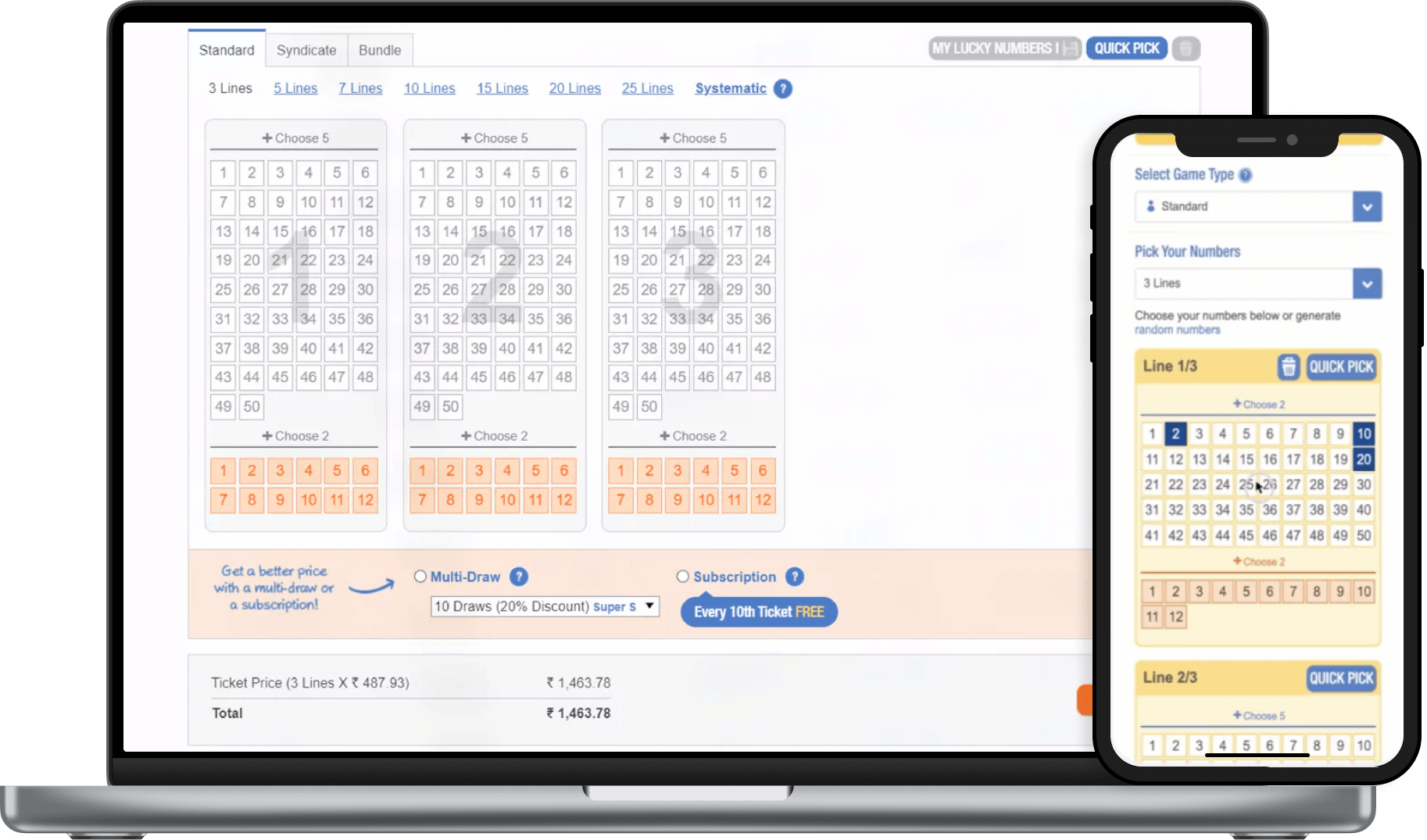
OVERVIEW
The lottery game platform required a complete UX/UI enhancement to improve usability, engagement, and player retention. The original design was cluttered and confusing, leading to drop-offs. My goal was to create a seamless and engaging experience that made it easier for users to understand game mechanics and participate effortlessly.
TEAM & TIMELINE
I collaborated with:
Scratch to Development: 5 months.
PROBLEM STATEMENT
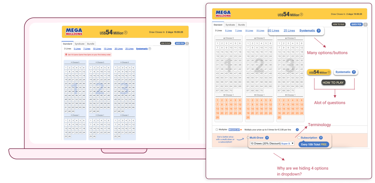
The existing platform struggled with 4 main issues:
PROCESS
1. Understanding the users
I conducted extensive user interviews and developed personas to identify common behaviors and pain points. Key findings included:
Usability issues
Users found the ticket selection process slow and unintuitive.
Overwhelmed
Most users selected 3, 5, or 7 lines, clearly indicating a strong preference for structured options, while other choices caused them to think and act more slowly.
Where is the value?
Users skipped key features to improve their chances of winning, limiting potential revenue from a product perspective.
James Carter, 60 years old
Boston, MassachusettsRetired Dentist Living with his wife
- Playing mostly for fun, once a week.
- Doesn’t want to share winnings
- Would like to have flexibility in choosing amount of lines
- Finds the QuickPick very helpful, save him time, using it 1 out of 2 lines.
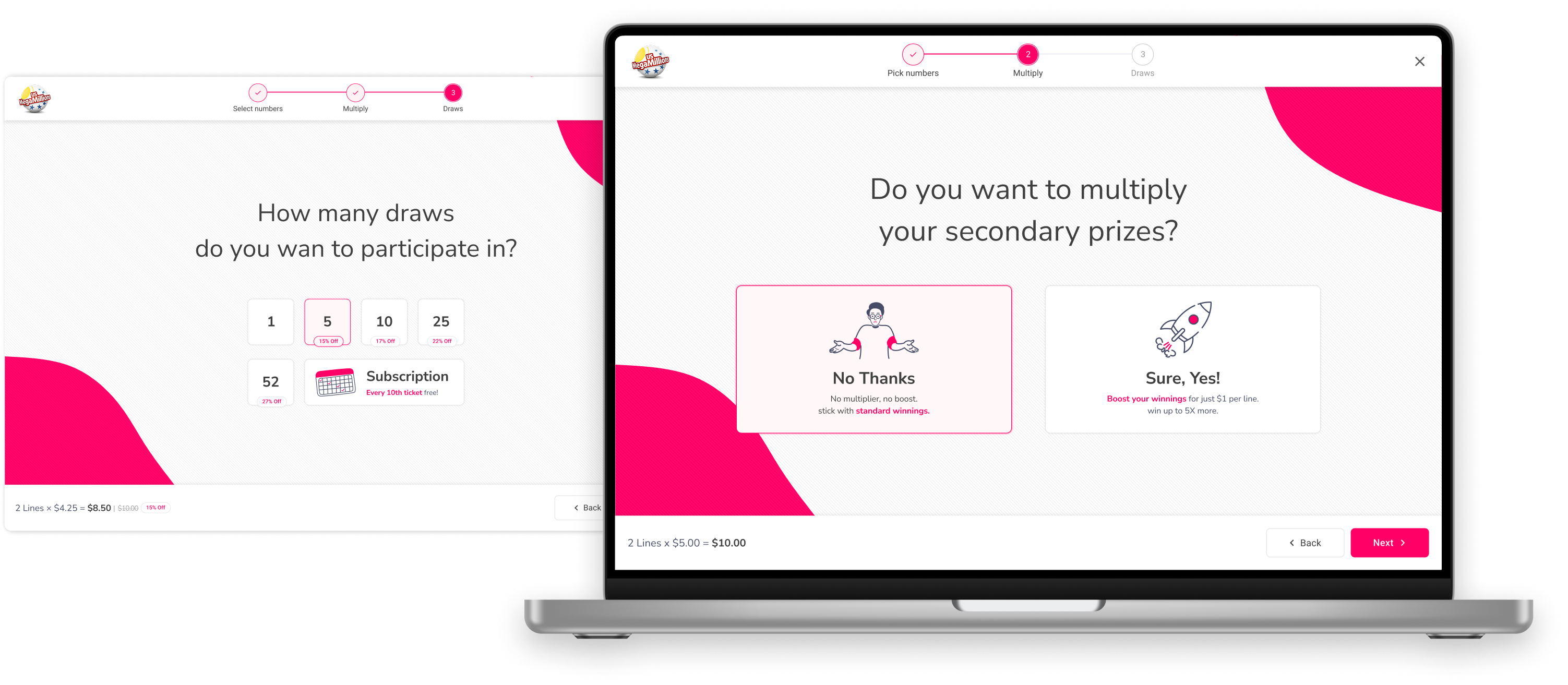
- Doesn’t understand the difference between multi-draw and subscription, therefore he’s not using it at all.
Chanice Leroy, 44 years old
Chicago, Illinois
Professional singer and dancer
Single mother of 2
- Purchasing online save her time.
- Doesn’t like our Bundles/Syndicates, wants to keep the winnings for herself.
- Wants the control of choosing more/less lines.
- Using the QuickPick for all the lines or average of 1 out of 2 lines.
- The price per line is not clear enough, it could be very unexpected.
2. Analyzing User Behavior
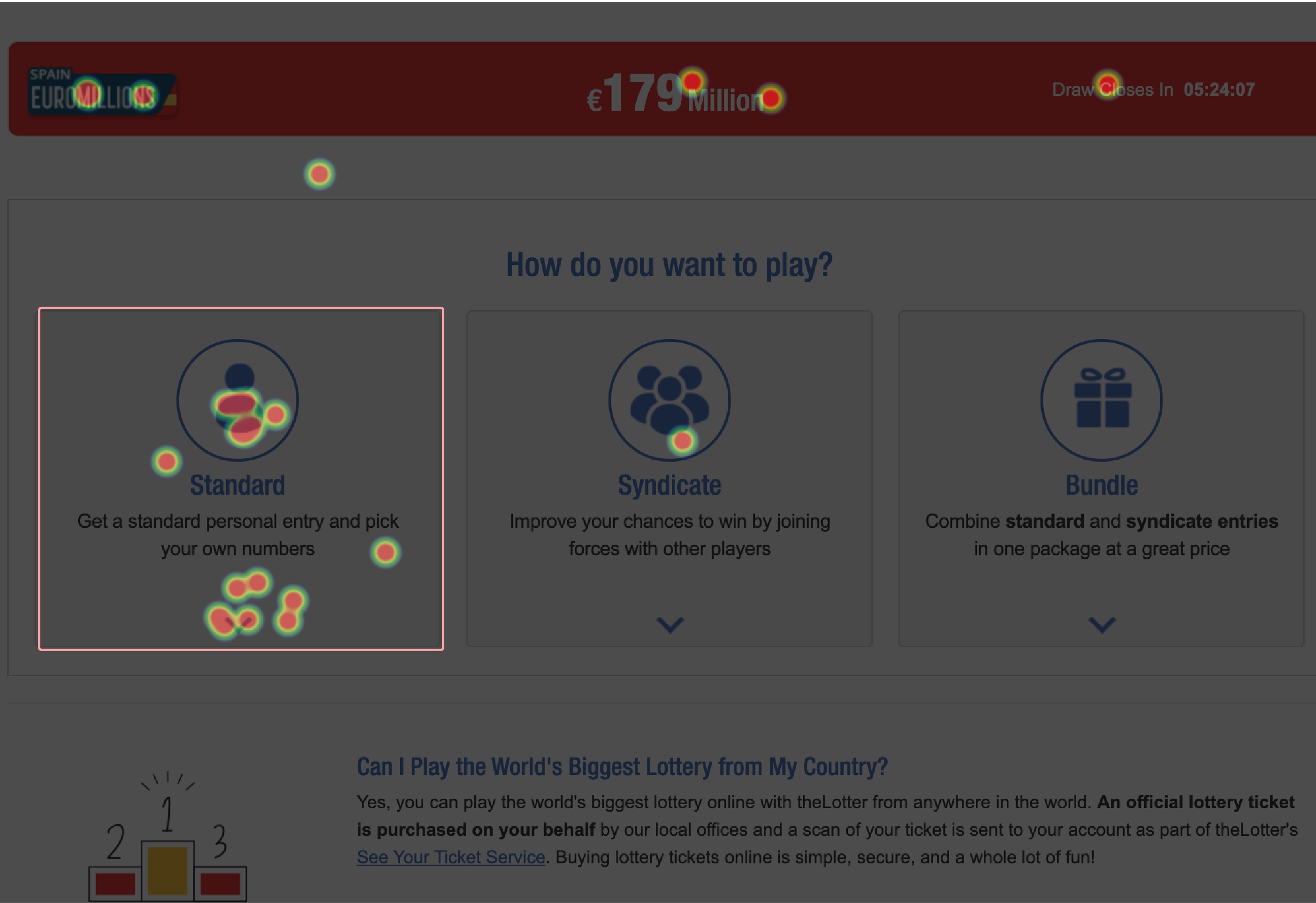
I used heatmaps, mouse tracking, and video recordings to identify problem areas in the existing experience:
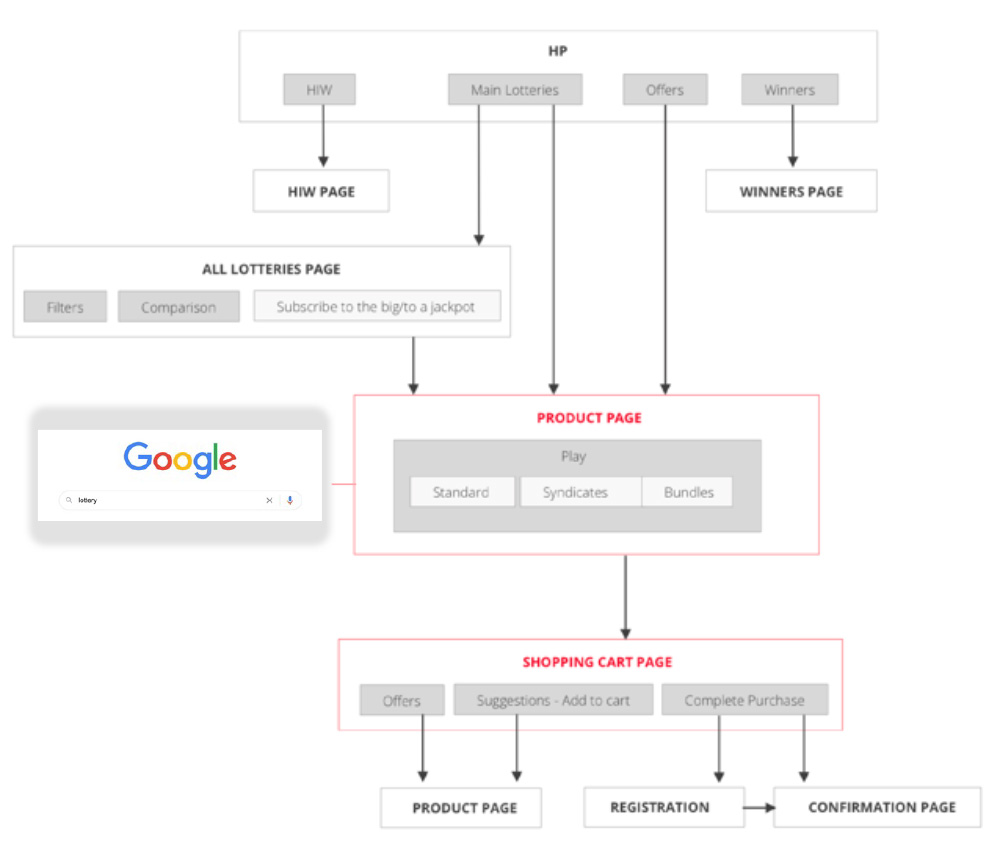
3. Mapping the Experience
I created a current site map and user journey to visualize the flow, pinpointing where users struggled most. These insights guided improvements in navigation, reducing unnecessary steps and ensuring a smoother transition from selection to checkout.
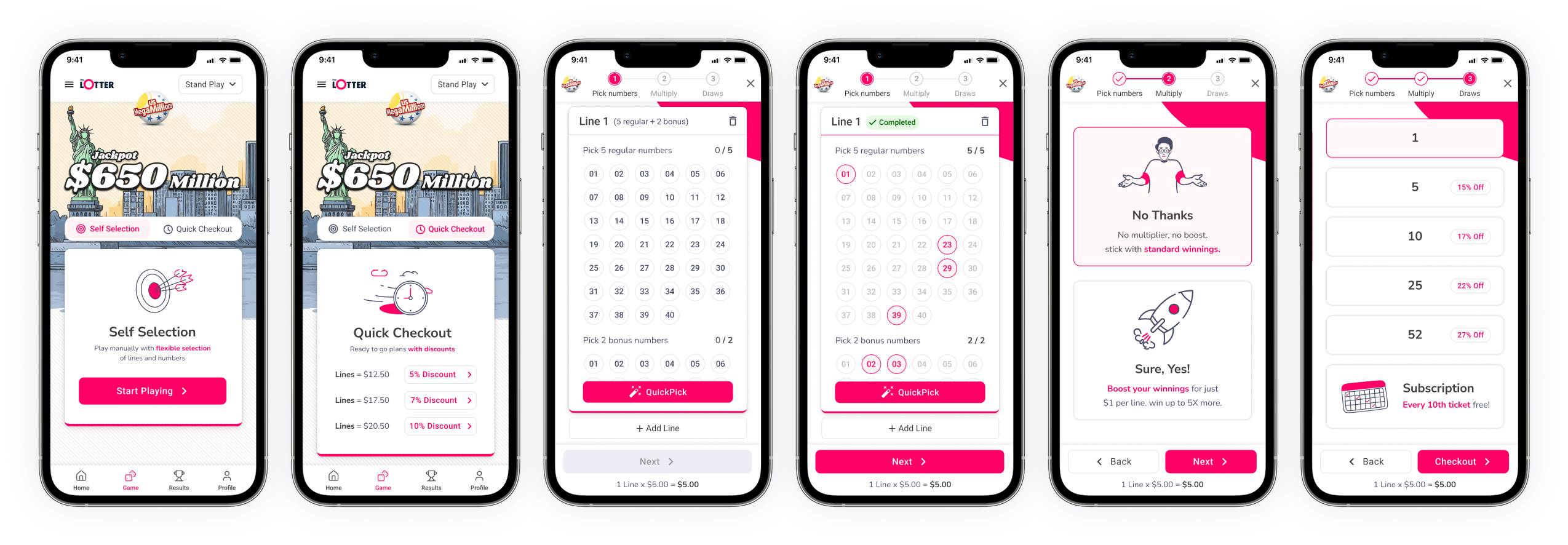
4.  Redesigning the Experience for Desktop & Mobile
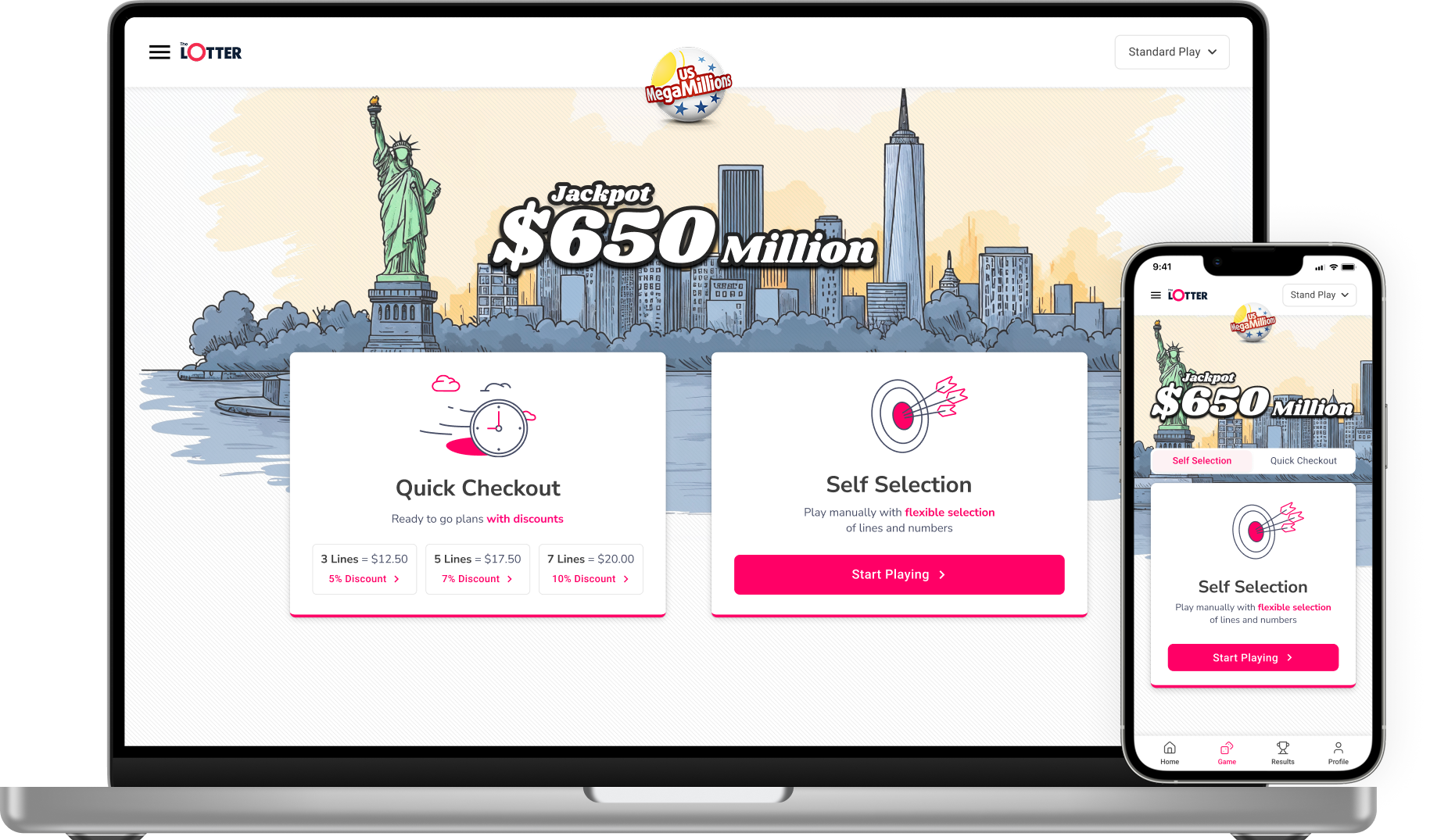
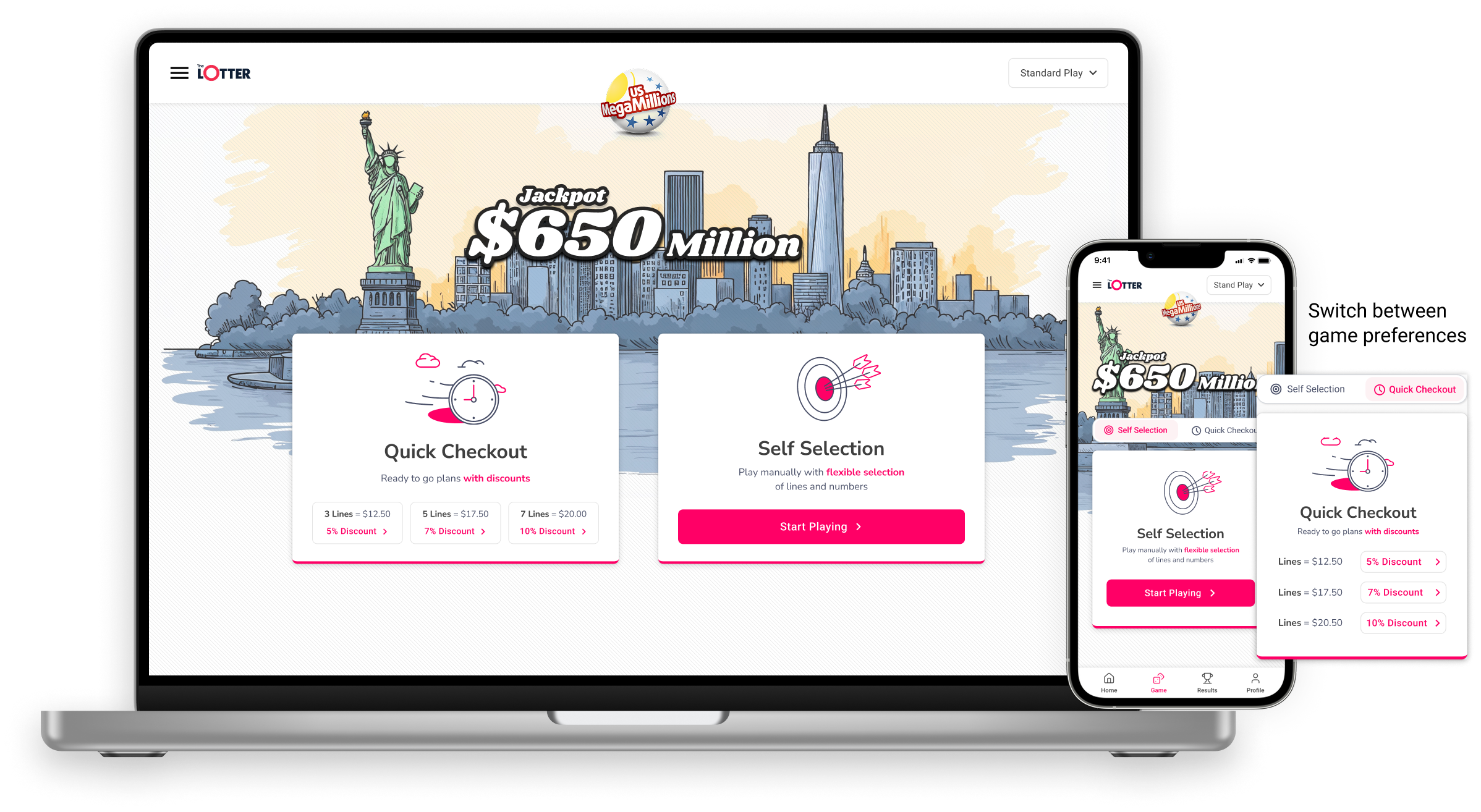
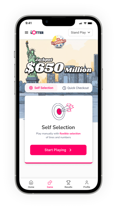
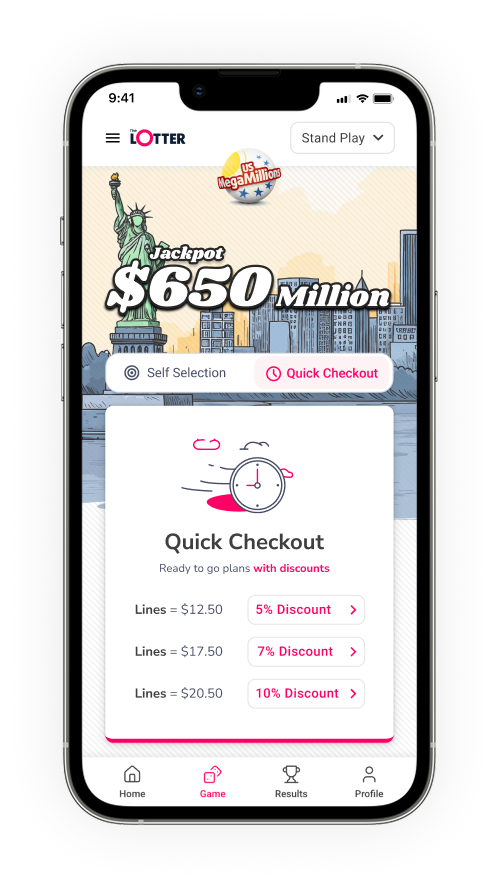
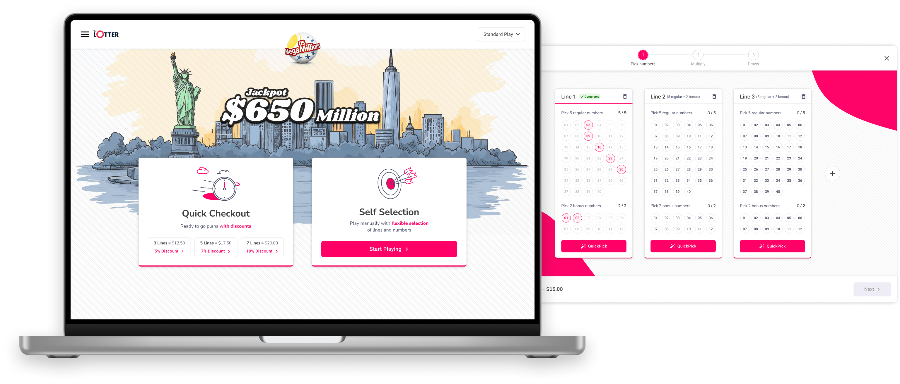
In the redesign, I enhanced the game experience by using playful fonts and accent colors to reinforce our gaming presence. Additionally, I incorporated a hand-drawn landmark of the country where the lottery is played to strengthen the thematic connection
Preset line selection
Users can choose between 3, 5, or 7 lines with built-in discounts.
Flexible selection
Players who prefer custom selections can still choose manually, but without discounts.
Improved navigation
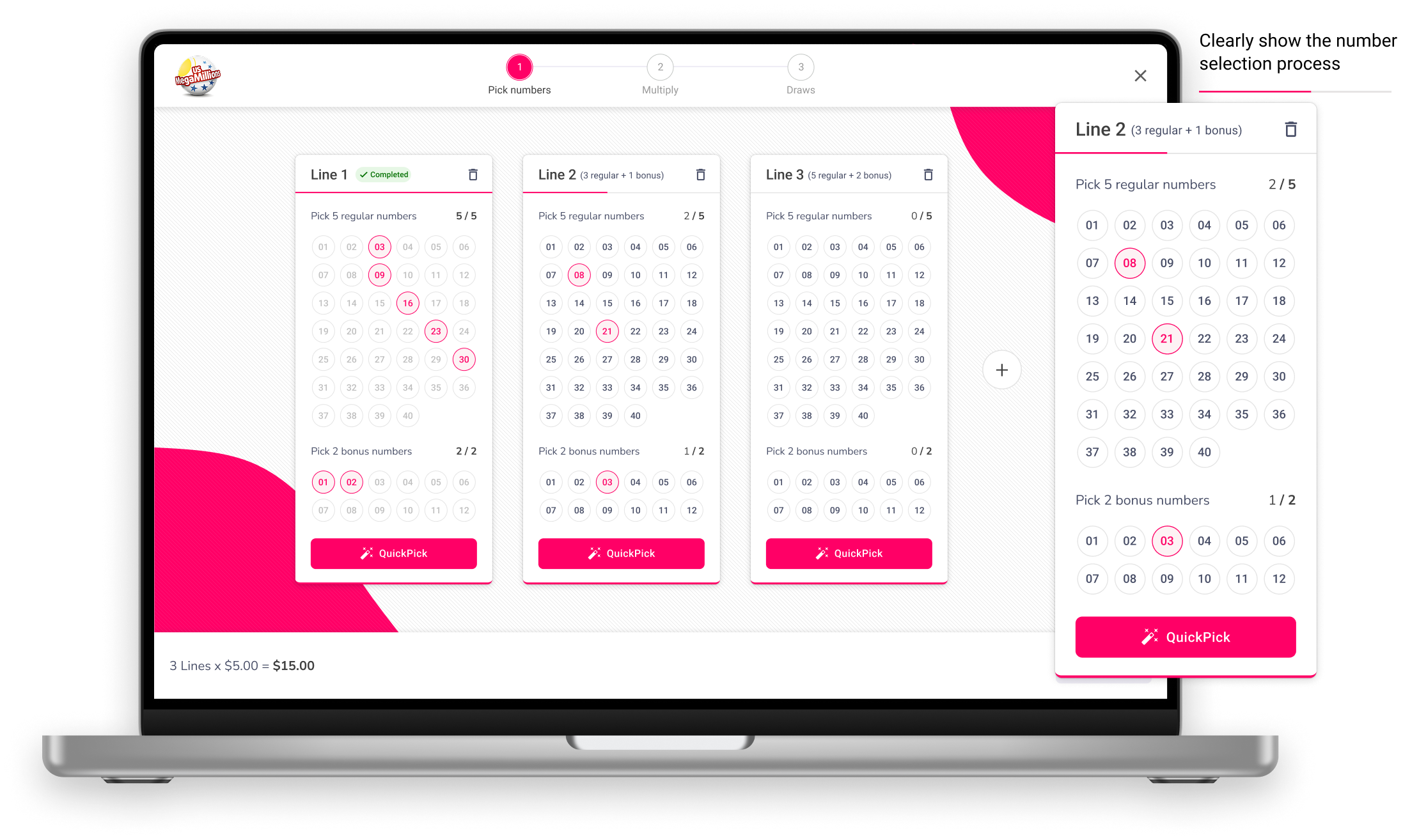
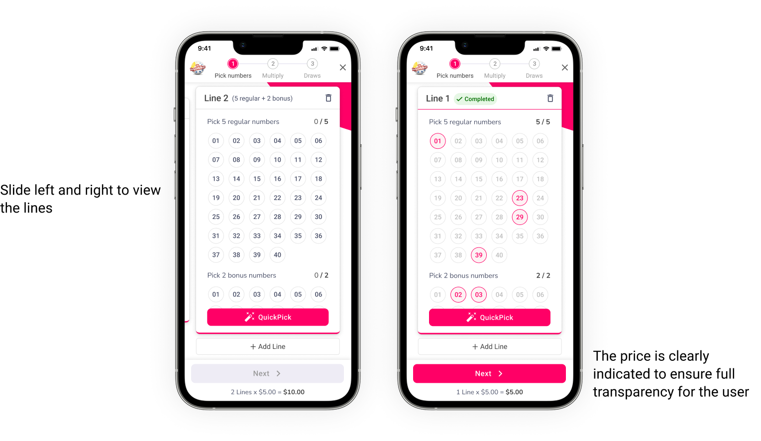
Simplified steps for an intuitive experience, with an added indicator to clearly show the number selection process.
Gamification
The “Add Line” option enhances the experience with engaging animations, making the selection process more interactive and encouraging.
End to end key screens
OUTCOME
A significant increase was observed in all major issues identified earlier. Here are the results:
📈 55% increase
in user engagement
📉 25% reduction
in drop-off rates during game participation
💖 Higher satisfaction
in drop-off rates during game participation
Quicker ticket selection
due to streamlined checkout options
FINAL PROTOTYPE
This project reinforced the importance of user research, behavioral analysis, and clear UI hierarchy in gamified experiences. By focusing on simplicity, efficiency, and engagement, we significantly improved the platform’s usability and player retention.

