 1. Research & Discovery
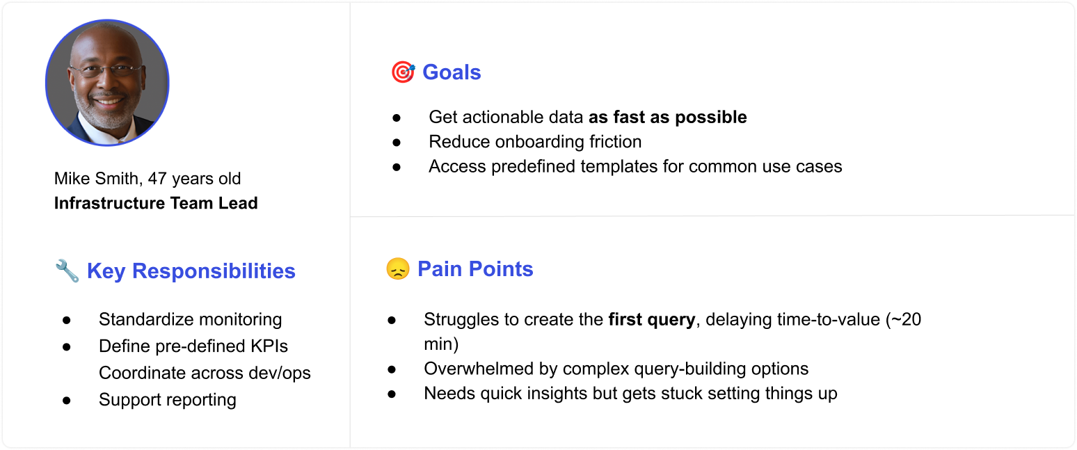
Who's using our product, and how are they using data to help their organization?
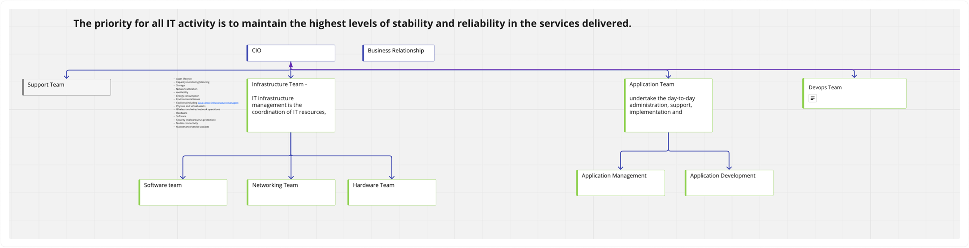
I held meetings with customer success reps and product managers to expand my understanding of our users. After a few sessions, I mapped out a common organizational structure, which helped us define key personas for designing targeted solutions.
 2. Current Flow
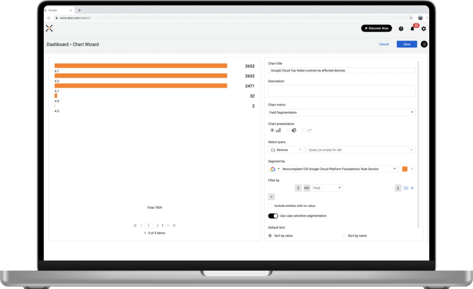
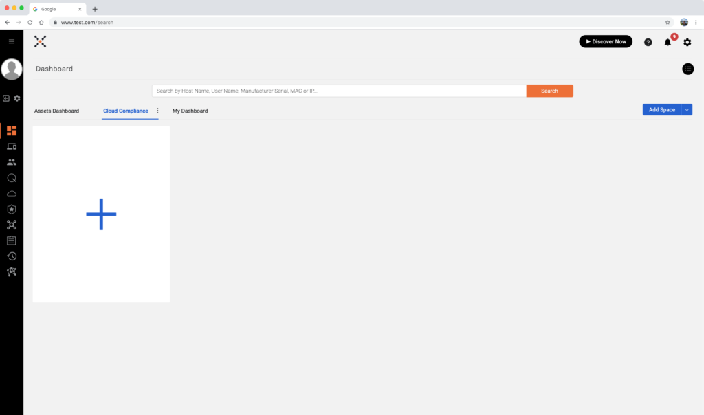
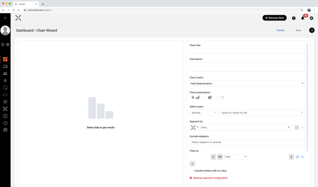
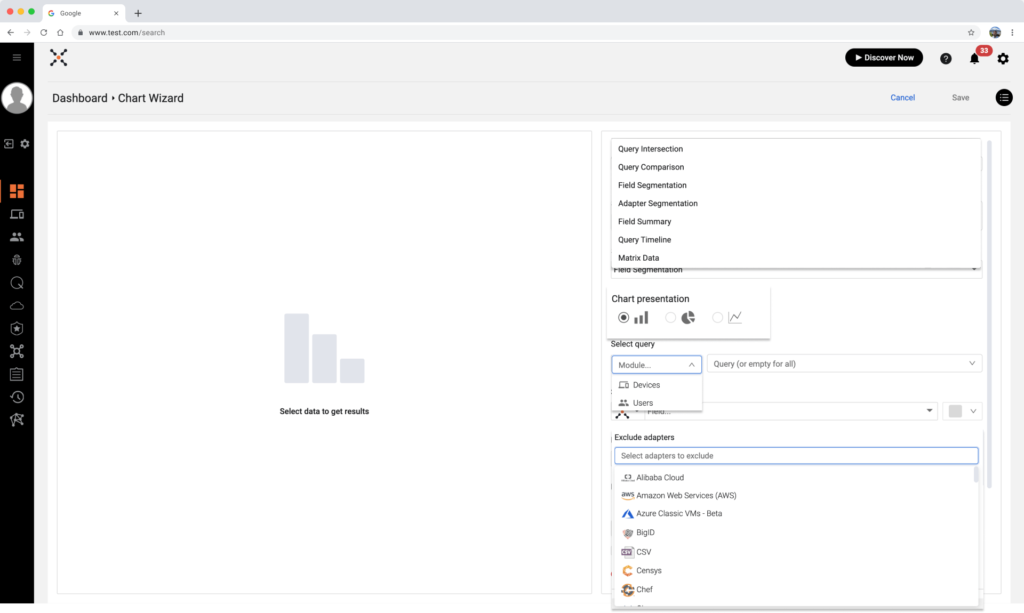
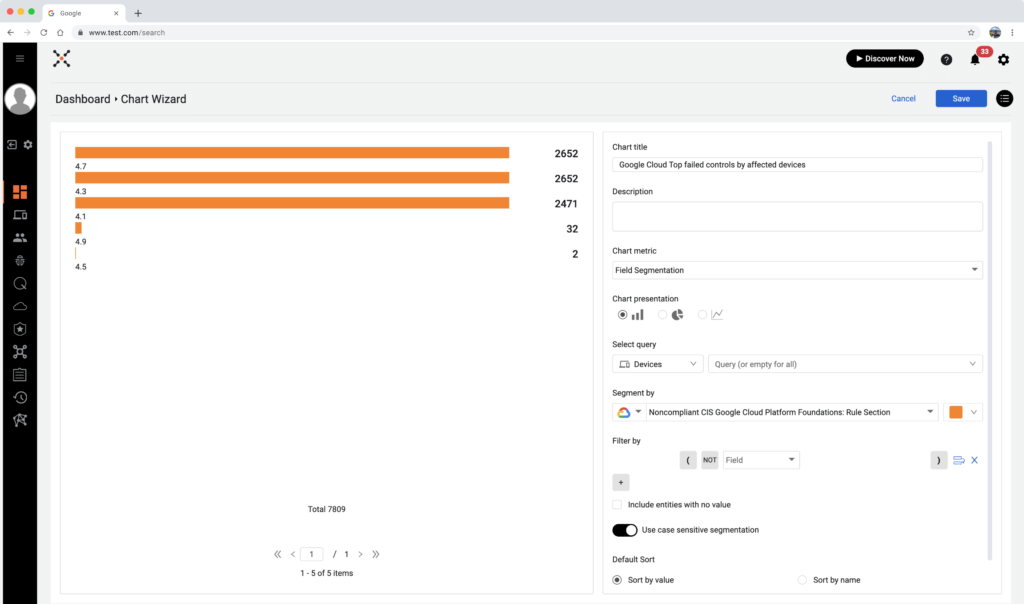
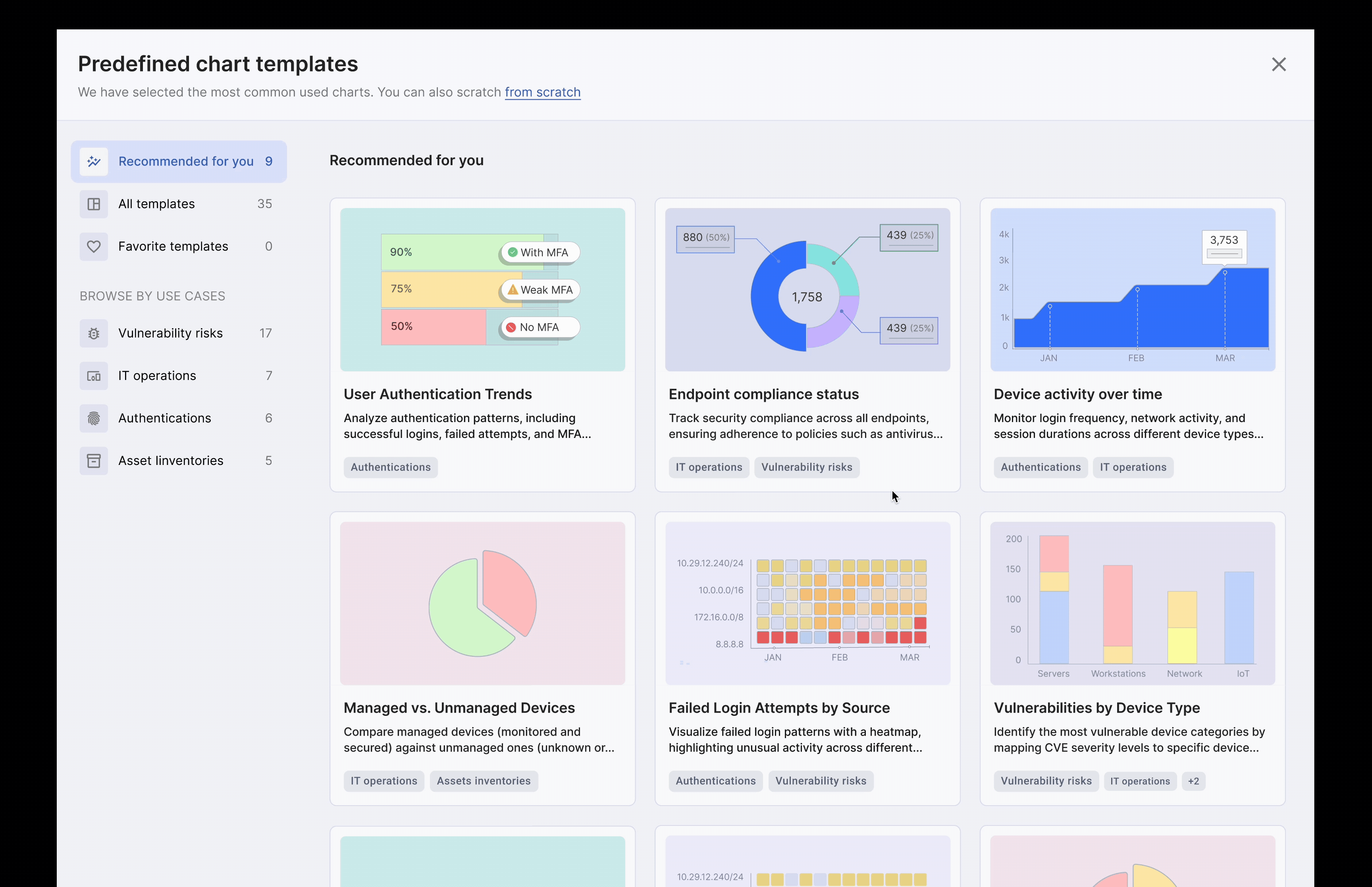
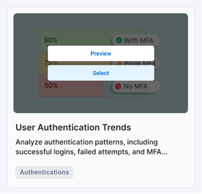
The current user flow to create data is a real “wrench in the works” for the platform, and a strategic, comprehensive problem. It is very hard to navigate, requiring too many steps to create charts of data and dashboards.
Take a look at the following snapshots that represent the user flow at its best. In each step the user has to learn terminology, analyze different chart metrics, deal with overwhelming components, and too many clicks to achieve his goal:
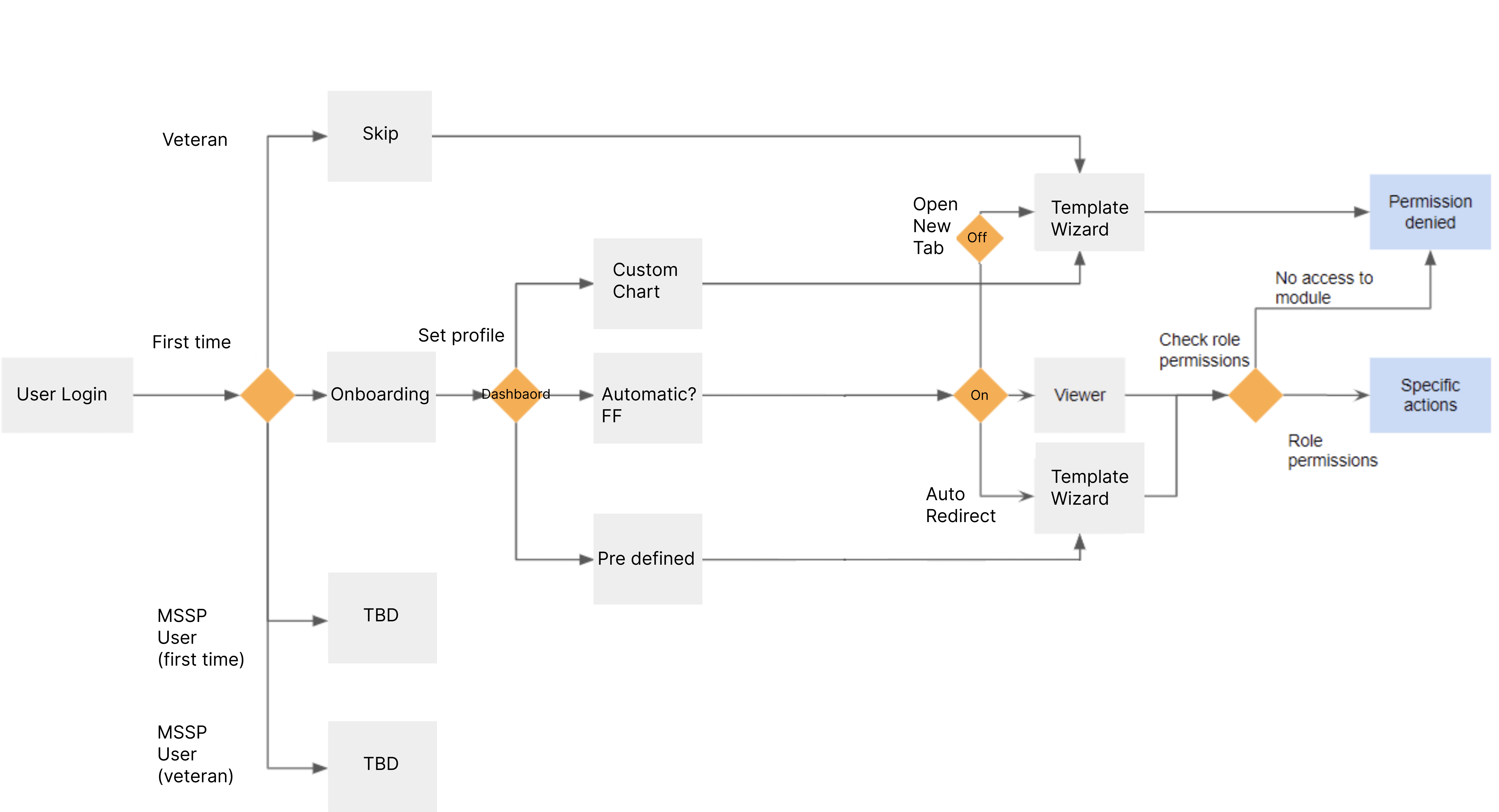
3. New Flow Diagram
Before getting into more details and visuals, I created a flow diagram that maps all the possible scenarios from the user end:
– First-time or veteran log-in?
– Show onboarding – Yes or No?
It was an interesting and complex task to validate the user’s role and his permission after he logged in and before the option to create new charts of data. I had to meet with the project developer to understand and define the logic and what would happen in the backend. If the user doesn’t have permission to add data, we have to detect it in time and deny him permission to go through the wizard flow.
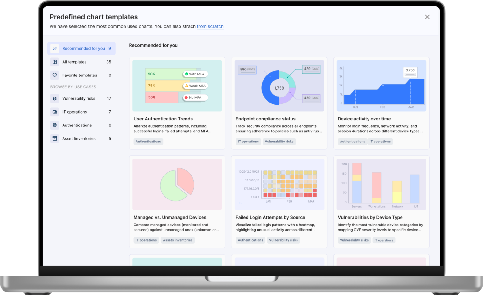
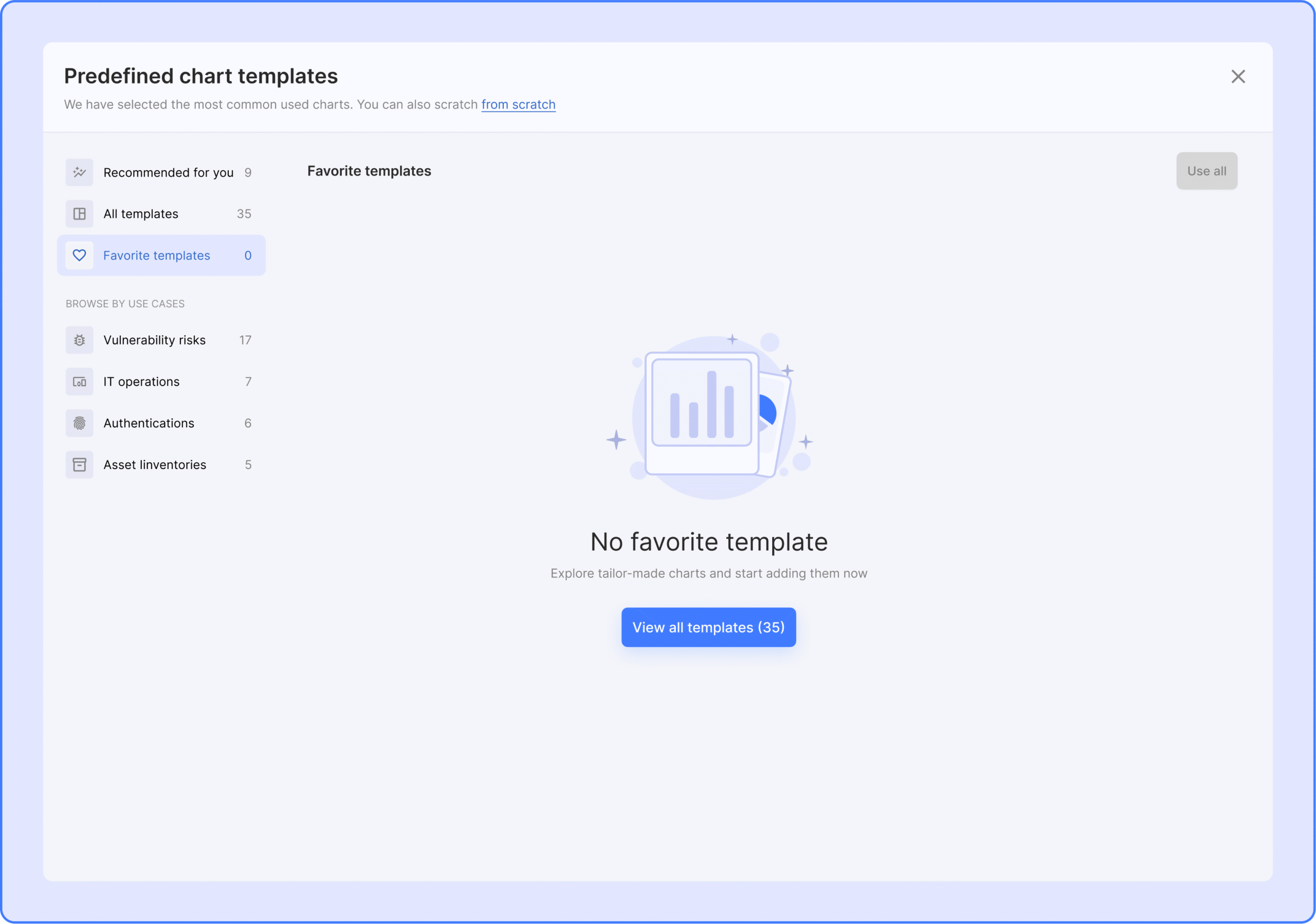
The Goal - always go through the pre-defined template wizard, no matter if you're a first-time user or a veteran
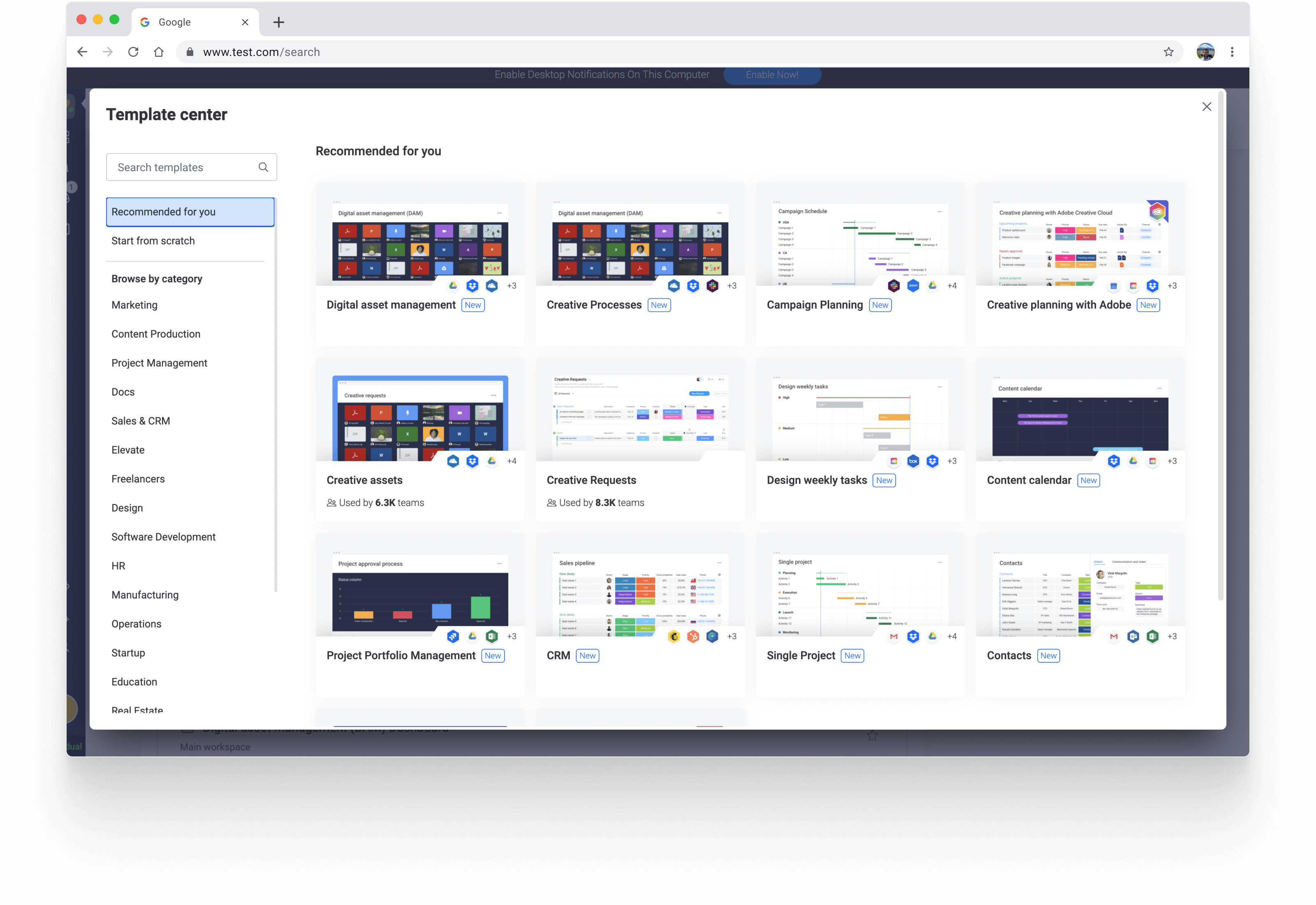
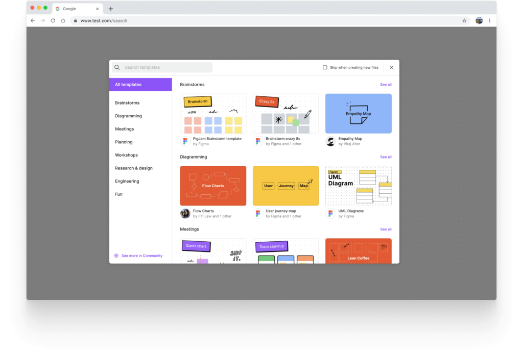
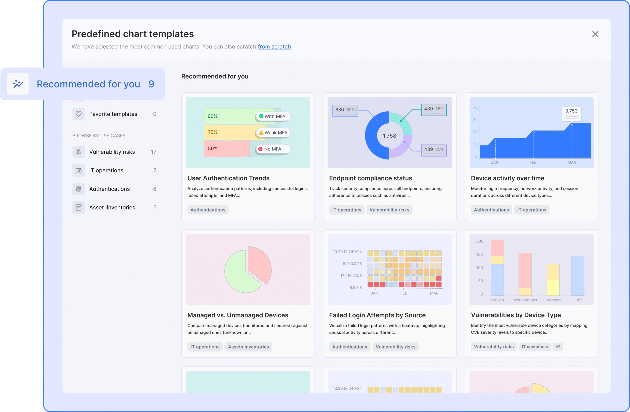
 4. Vendor Research & Design Inspiration
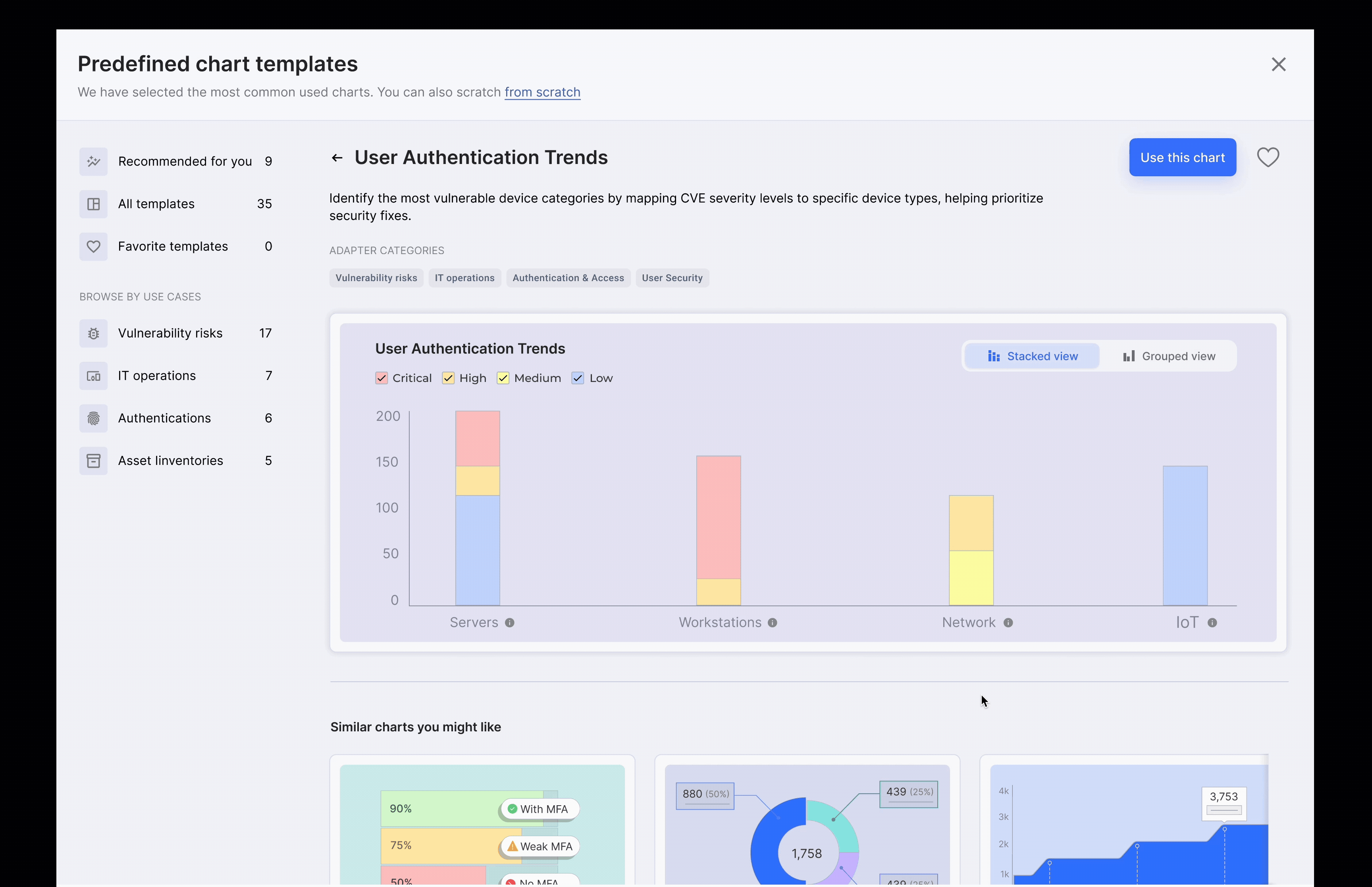
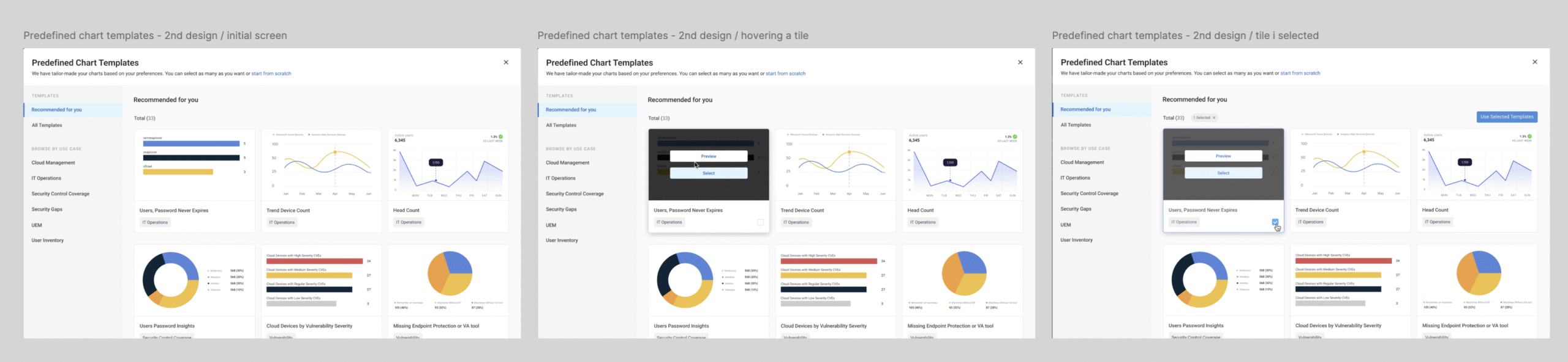
I explored many platforms in our domains and some overlapping domains to get inspiration about how the pre-defined chart wizard should look and behave. As you are going to see, there are clear steps to creating the wizard: Left side with categories, search, etc.… and the focus area (center) where all the chart templates will be placed.
 80% reduction in onboarding