Platform • Duration: Jan-April 2022
In today’s world, every second is critical in terms of Cybersecurity. With this in mind, I came up with an initiative to increase the Time to Value for the user, and reflect all his organization’s data as fast as possible.
I faced two challenges with this project:
1. I had to learn all about a completely new industry while providing a first-class user experience (being a fast learner helped me here).
2. Working in a start-up environment I needed to provide solutions fast. While being deeply immersed in the project I had to simultaneously work on contributing a whole new component and create full documentation for our design system.
I worked closely with the Product Manager, Developer, and Solution Architect.
1. Research
I had online meetings with several of our customer success representatives and product managers to better understand our users. At this point, I had only worked on the project for 2 months, so I had to expand my knowledge of our users and their autonomies.
After a few sessions, Lior (the PM) and I started to map a common organization structure hierarchy.

2. User Flow and Inspiration
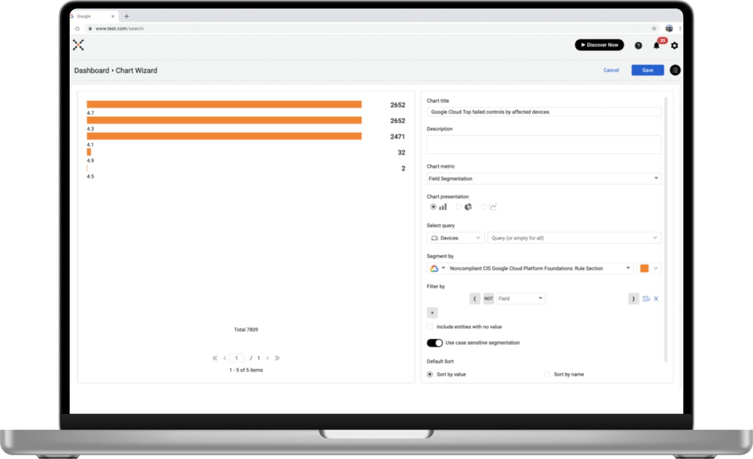
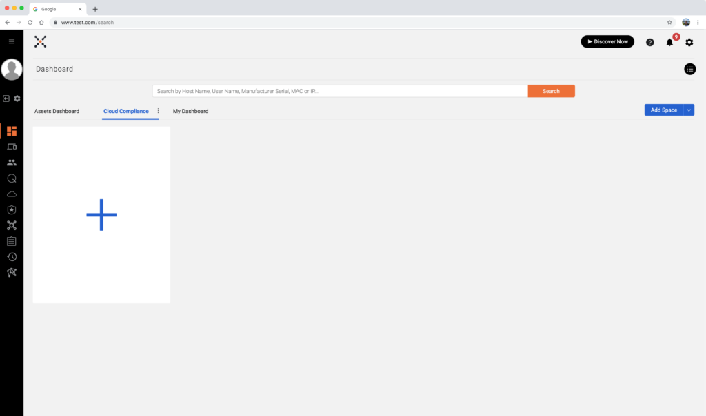
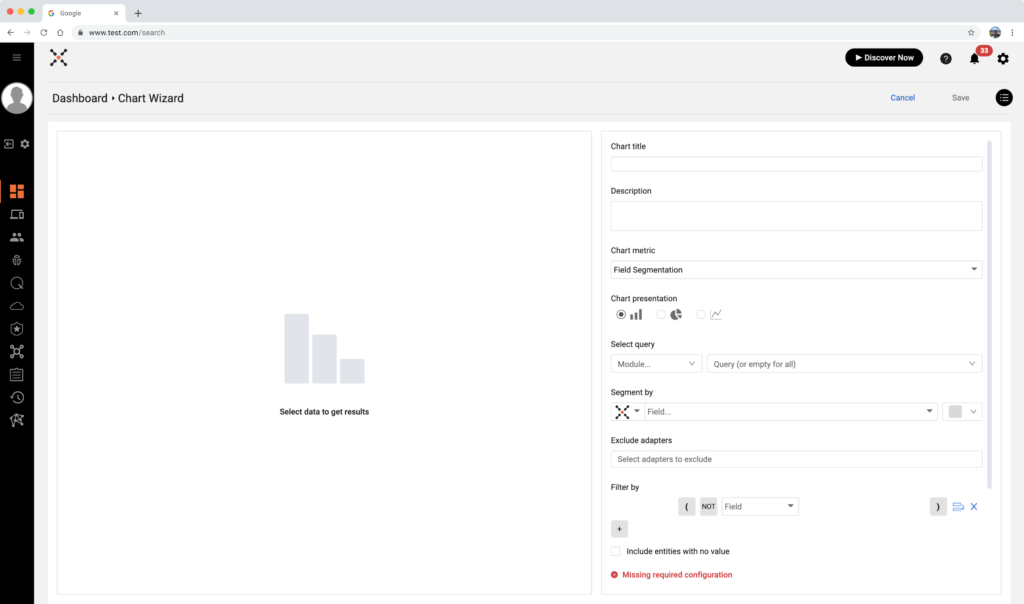
The current user flow to create data is a real “wrench in the works” for the platform, and a strategic, comprehensive problem. It is very hard to navigate, requiring too many steps to create charts of data and dashboards.
Take a look at the following snapshots that represent the user flow at its best. In each step the user has to learn terminology, analyze different chart metrics, deal with overwhelming components, and too many clicks to achieve his goal:
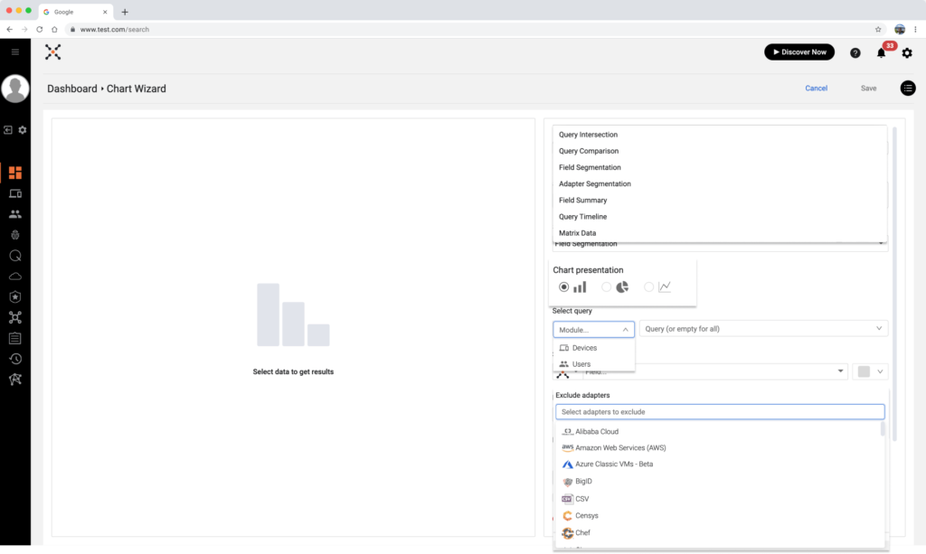
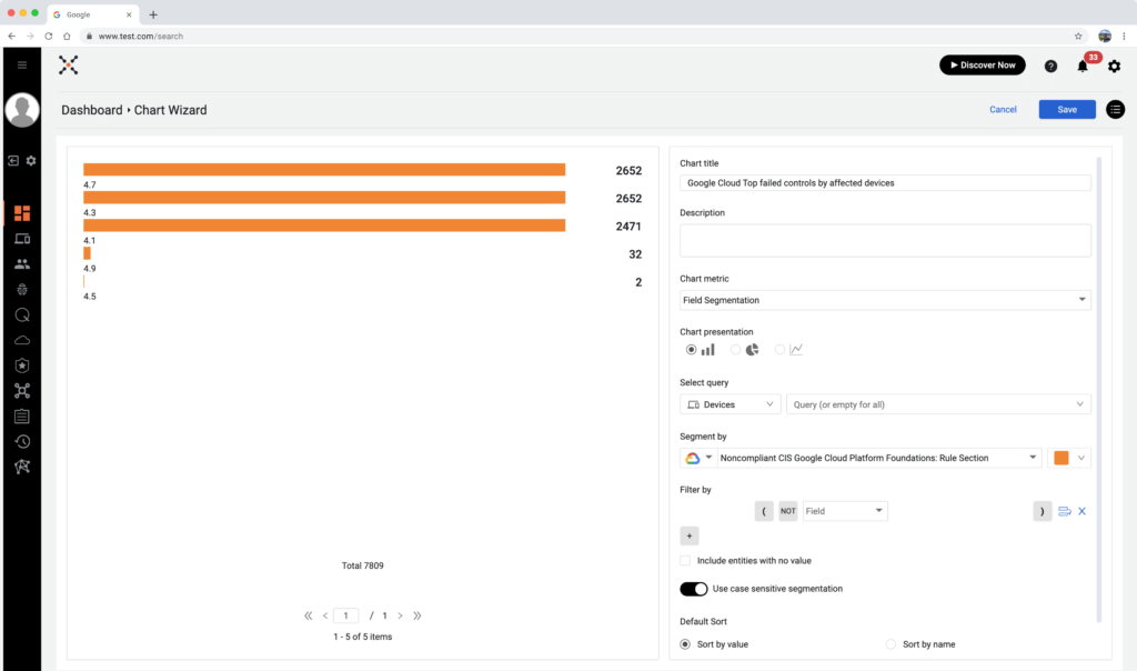
Before getting into more details and visuals, I created a diagram (together with the PM) that maps all the possible scenarios from the user end.
– First-time or veteran log-in?
– Show onboarding – Yes or No? etc…
It was an interesting and complex task to validate the user’s role and his permission after he logged in and before the option to create new charts of data. I had to meet with the project developer to understand and define the logic and what would happen in the backend. If the user doesn’t have permission to add data, we have to detect it in time and deny him permission to go through the wizard flow.
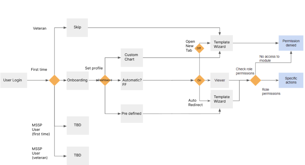
After finishing the user flow diagram I’d discovered 2 nodes, that are connected to each other:
1. Onboarding -to collect as much information as possible about our user and his level of expertise.
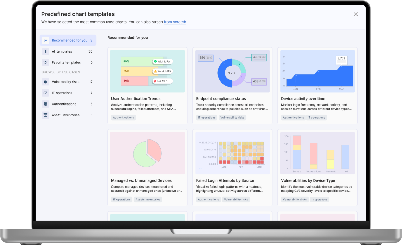
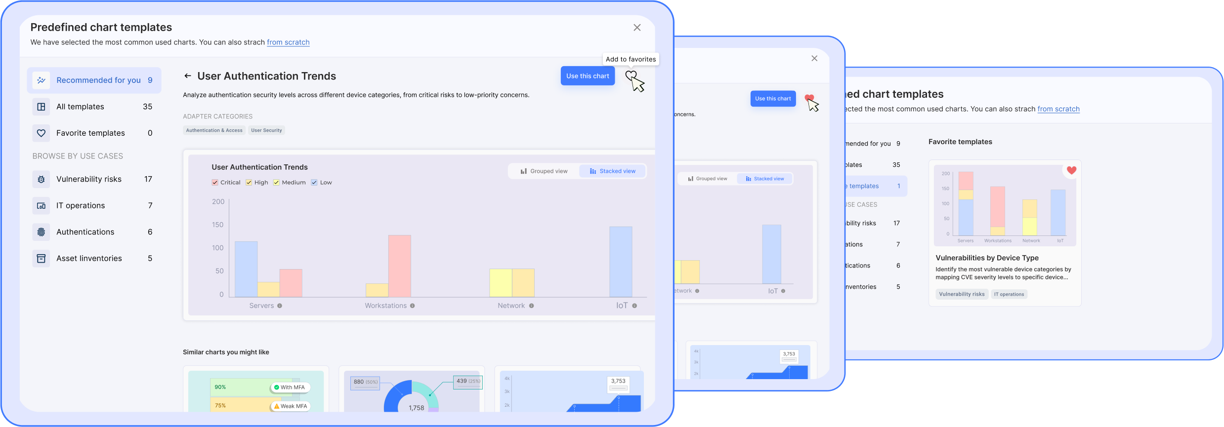
2. Pre defined charts (AKA “Template Wizard”) – here we actually increase the Time to Value for the user.
The above will be an excellent solution to solving the platform’s strategic problem.
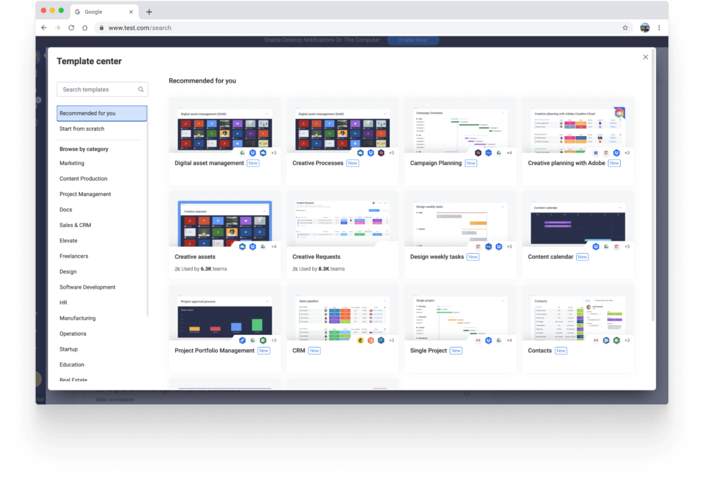
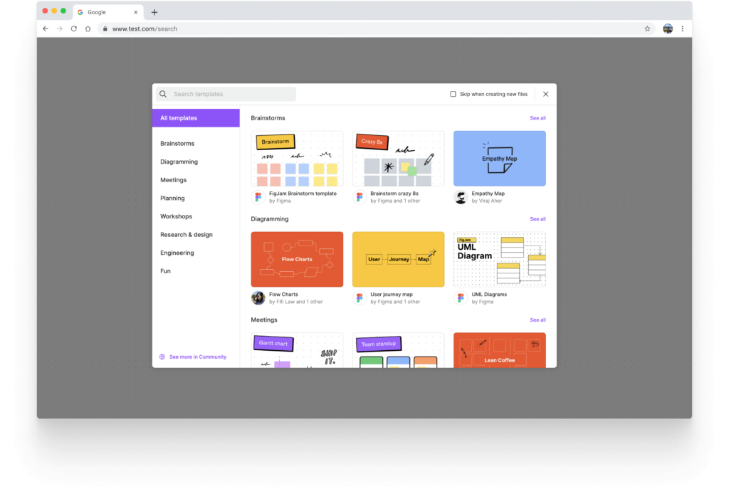
I explored many platforms in our domains and some overlapping domains to get inspiration about how the pre-defined chart wizard should look and behave. As you are going to see, there are clear steps to creating the wizard:
Left side with categories, search, etc.… and the focus area (center) where all the chart templates will be placed.


3. UI Design
Thanks to the Wizard, now users can create out-of-the-box charts with relevant data to meet their organization’s needs. But I felt that the experience could be refined even further.
In the first mock, users had the opportunity to select one chart at a time. I followed best practices BUT I was inspired and felt that this situation was different. The user would gain even more value if he was able to select as many charts as he wanted. Not only that but there are even plans to expand the capability of the wizard in later phases, to allow users to create a full dashboard with 4-10 charts of data.

During this initiative journey, I had the pleasure to meet important autnomis from various of companys. I had the oppurtunity to “dive” into their area o responsibilities and learn how they use data and what’s in their top priority.
I learned about important use case for each user and I has the pleasure to take their experience to the next level.
Design
The design of this Wizard was very fun and felt very intutive by the fact that we have Design System with clear guidance. I kept the platform look and feel and didn’t invent the wheel.
Experience
Shorten the Time to Value from aveage of 10 minutes of creating new data for new users and 5-10 minutes o veteran to only 2-3 minutes (depending if the user selects one or more charts) had a freat impact for our customers, and thefore we got many thank you emails. This things is my engine that push me forward the next challege with a smile 🙂
