Cross-Platform • Initiated: Mar’ 2020
Cross-Platform • Duration: Jan 2020-Ongoing
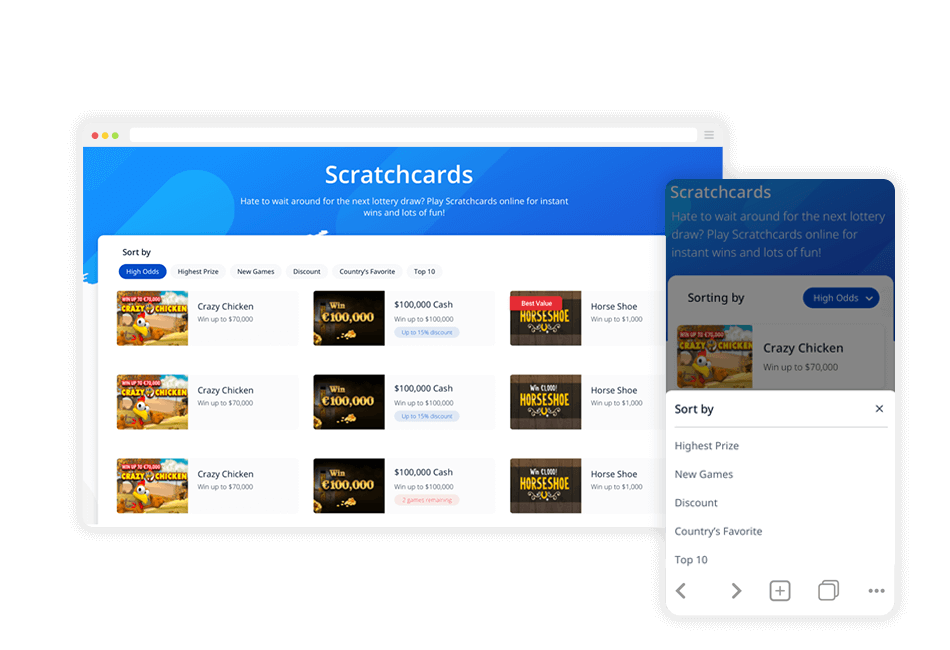
As part of the product redesign project, I had the opportunity to build theLotter’s design system from scratch, and improve the usability of all the components.
I was the only product designer during this period and replaced my boss who was on maternity leave for 8 months. So, I had the opportunity to initiate this process by myself.
The main challenge was to work simultaneously on creating the design system from scratch and the initiation of the overall site redesign.
I worked closely with the Product Owners, Head of Product, CTO and Developers.
1. Research
Short Background
Atomic Design and Design Systems were pretty new to me at the start of the process. I discovered them by talking with Guy, the CTO of the company. He told me his plan to transition to this methodology for the new site and explained to me how I should look at it from my end.
Basically, there are five distinct levels in atomic design: Atoms, Molecules, Organisms, Templates, and Pages. After our conversation, I read more about it and I discovered Design Systems.
Basically, it’s a set of standards to manage design at scale, by reducing redundancy, while creating a shared language and visual consistency across different pages and channels.
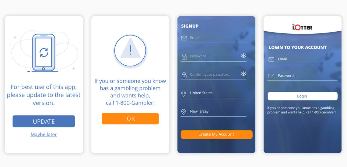
I started by auditing our product on different platforms – web and app. I listed all instances of particular components (CTA, Cards, Tables, Illustrations, etc.) on the different pages and user flows.
To better demonstrate those issues, let me share with you the recordings and screenshots of several pages.

I read many articles and recommendations about various existing design systems. I listed each design system’s pros and cons and I decided to go with 3 that best fit our needs:
Material Design, Atlassian and Carbon (IBM)

In collaboration with my peers (Head of Product and Product Owners), we decided to pick 3 common principles that improve the user experience and allow us flexibility and better communication between the product designer and the developers.
2. Documentation
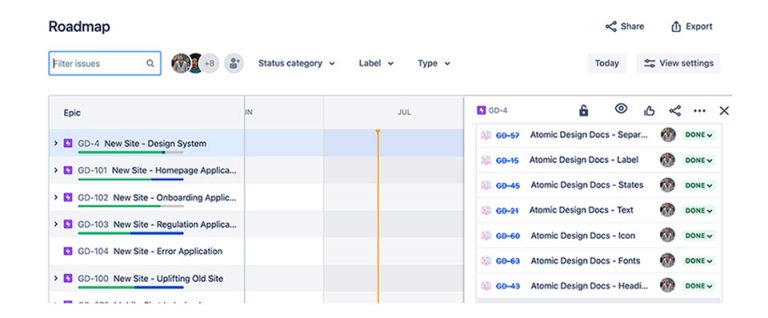
The product owner of this project (Matan) sent me a list of requirements, what components should be considered as high priority and built first, and where each component can be found. The communication for this process was with Jira and Confluence.
On the right side of the roadmap, you can find the first Atoms I worked on, based on them I could later build complex Molecules and Organism.
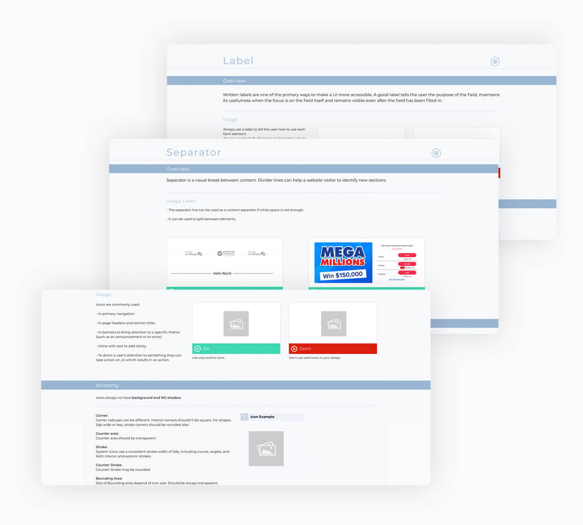
For each Atom, I created very detailed documentation with clear guidance and a set of rules. I also decided to add some “Do’s and Don’ts” best practices, as I had seen done in top design systems, so there wouldn’t be room for any gaps that might come up during the process.
Overview, Types, Anatomy, Specs, Sizes, Placement, Content and Related
Placement, Accessible, Responsiveness and other section that might be needed
I’m having two revisions for the document – 1st draft contains the set of rules and definitions, containing image place holder just for the structure.
The final version is closing the edges and having a brief review, replacing the place holders with the real component
3. UI Design
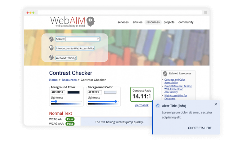
Each component is having high contrast combination of background and the text. To make sure it’s designed properly I’m checking it online based on WCAG recommended ratios. Thanks to that I can assure that people who are partially or completely color-blind would see the differences between the colors. It also creates strong visual hierarchy and improves the usability.
Other approaches I’m considering while designing to keep the minimum size on mobile 48px for a more accessible tap area and I’m making sure each components that would support keyboard would have visual indication for this.
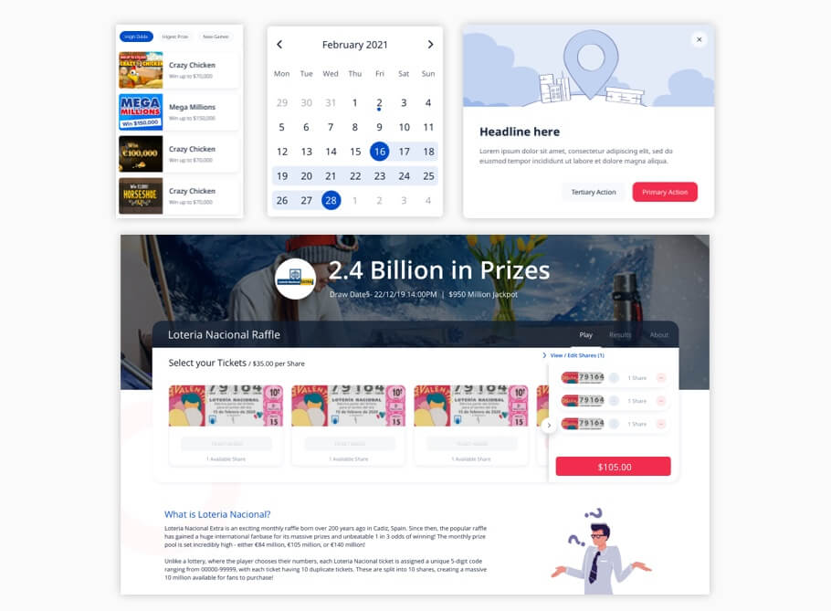
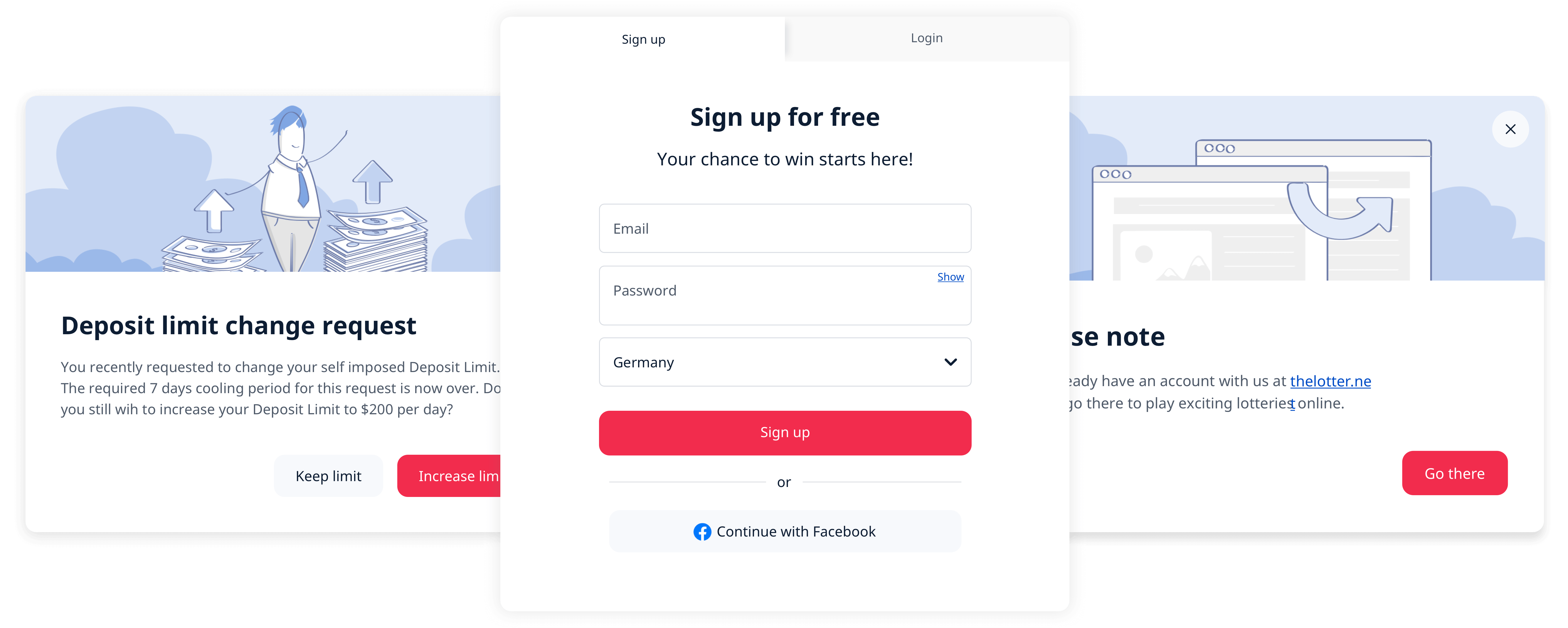
All the component will share the same design language that I approved in collaboration with other departments (Acquisition, Retention and Content). They will have modern and clean look and feel. All the shapes must have rounded corners (fits pretty good to lottery) and because it’s more pleasant and visual appealing to the eye, rather than sharp shapes.
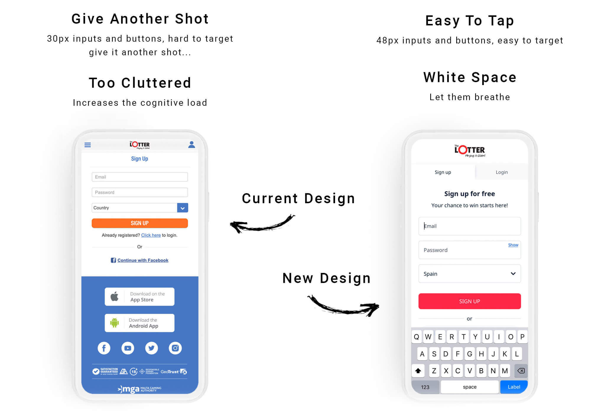
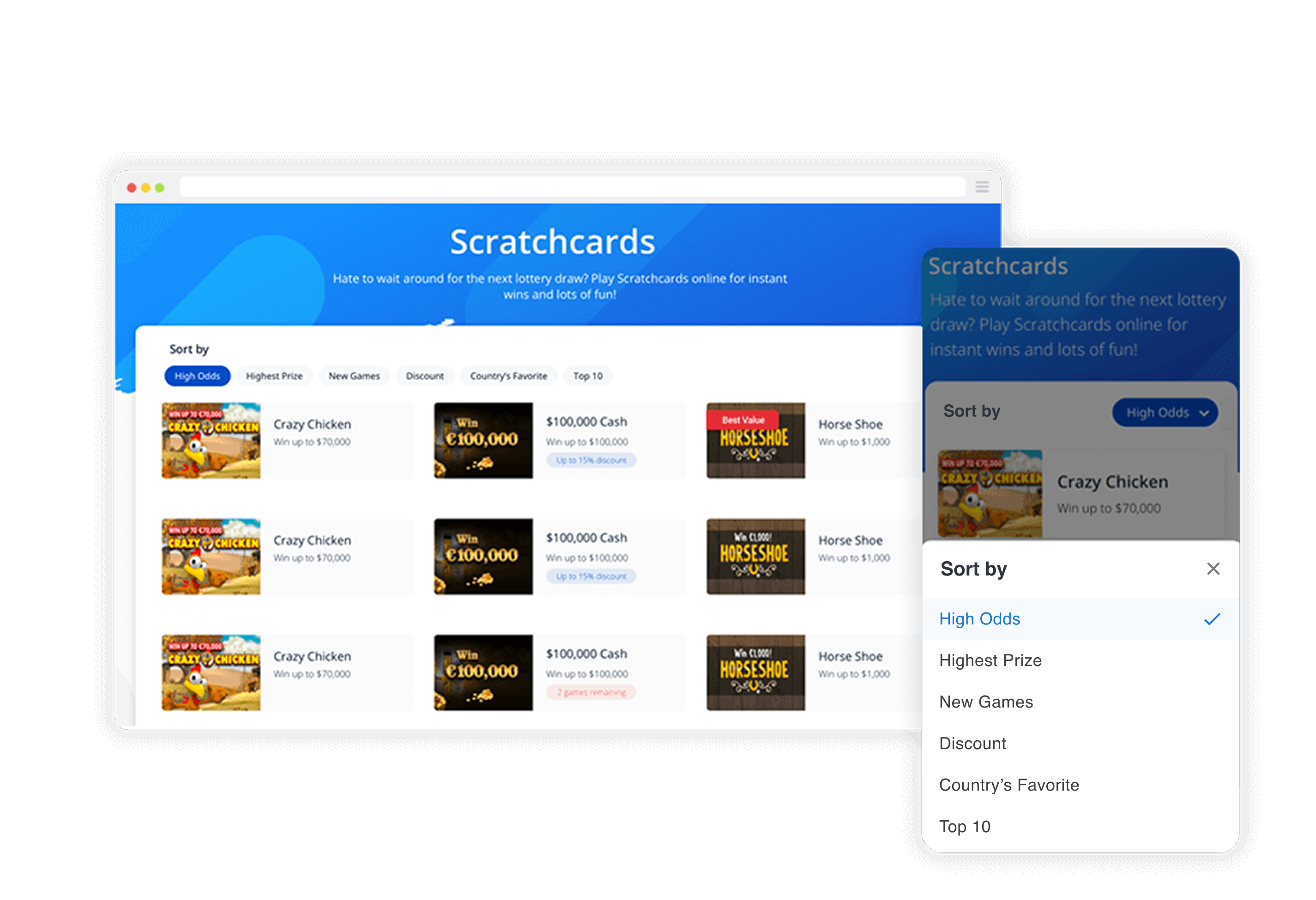
The way I organized the Atomic design library was dynamic. This means that the components that other peers will later use in the interfaces, should be inherited from one main Sketch library taken from Sketch Cloud.
That way, changes applied to a component in the library will apply to all instances of that component throughout every project file the team works on.
Based on the master symbol, I created all other symbols and just adjusting the color/states, etc…

The way I organize the Atoms helps me later to create the most powerful and easy to use components.
I do it with smart layouts
No room for inconsistency, cross applications usage. Each atom is flexible and can be replaced which means if you wish to remove illustrations and add tabs? No problem. Remove the paragraph and add form? No problem, It’s your call.
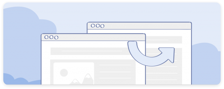
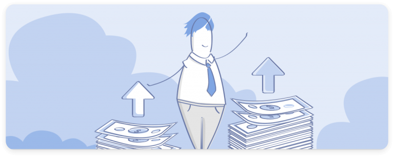
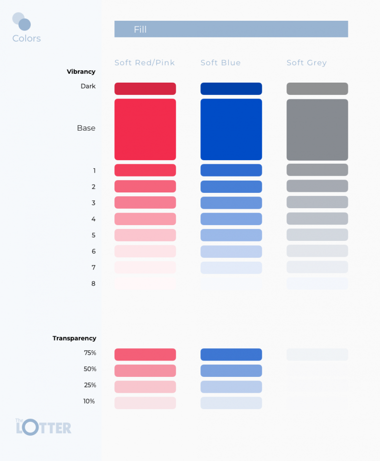
Now we have a big batch of illustrations that fit all the scenarios that might be tackled during the work. We use the same blue color palette for all of the illustration backgrounds.
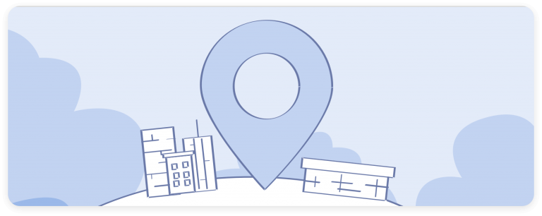
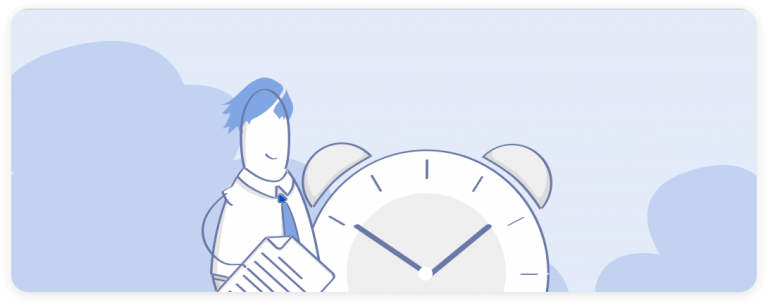
Our product is supported in over 14 languages, which means we need to select different fonts for each language. No more hard work, Noto Sans is cross-language support, which means one font for all the languages.

4. QA and Approve
The QA phase is one of my favorites because you actually see your design coming to life. If everything goes smoothly and the outcome looks like the design I provided, we’ll have a green light to go. Many times, we have gaps (we all know developers are one of a kind, don’t we? 🙂
Thanks to the fact that I studied web development and design, I really like front-end coding. In this phase, I have the advantage of knowing how to communicate with the developer.
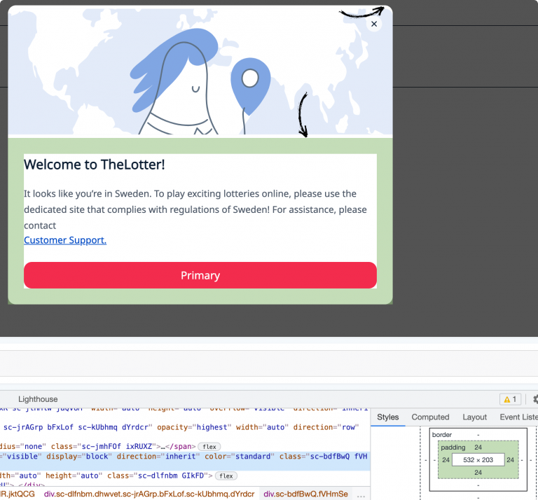
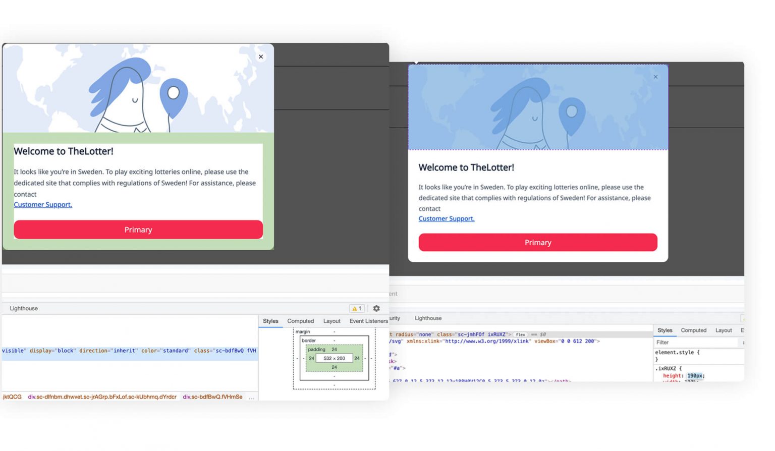
From my end, I’m testing the components in our storybook, If I see a discrepancy between the design and the outcome I open the firebug (aka inspect elements). I make the fixes that are needed and provide them to the developer.
When the developer doesn’t know what to do, I’m always happy to help, and it always saves us valuable time.
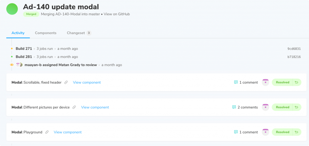
Huston we have a problem! The outcome have 3 redundant pixels at the top of the container and the image is 10 pixel higher.
Working on the design system from scratch has been very challenging, but it has brought about many positive benefits for the company on different levels:
