Web Application • Duration: Sep’2020-Apr’2021
Lottery Game Process
- Research
- User testing
- Wireframes
- UX / UI Design
- Prototype
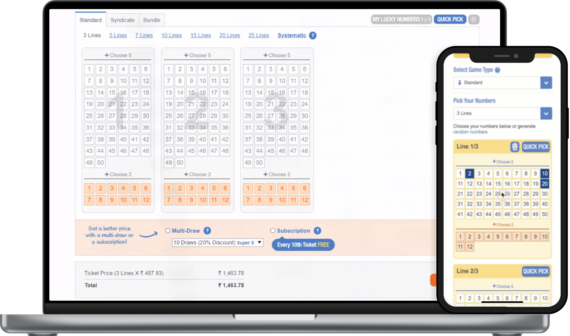
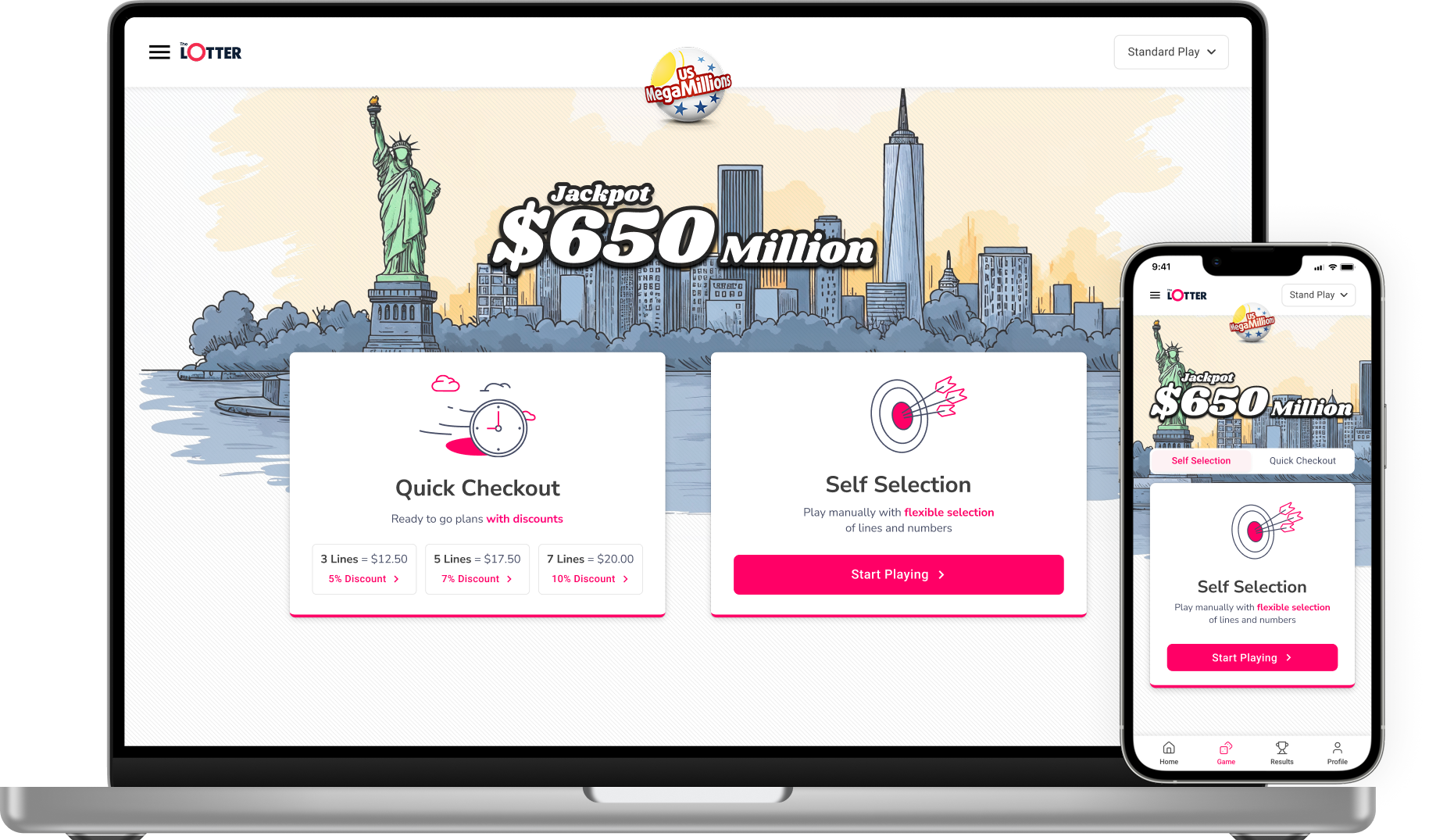
theLotter is a worldwide online ticket purchasing service, providing customers with the opportunity to play the biggest lottery draws. The site undertook a web redesign, and I had the opportunity to improve the company’s main product (lottery games).
Challenge
- To simplify the game process which had multiple play options, different packages, and too much information.
- Convince more people to increase their purchase with our multiplier feature, and get them to upgrade to multi-draw / subscription games.
- A large part of this project happened during the COVID-19 crisis, which made it even more challenging to communicate with all relevant remote teams.
Teams
I worked in collaboration with the Product Owner (PO), Customer Support Agents, developers, CTO, Retention Manager, and my teammates.
3 Steps Process
1. Data Collection
Methods – Which, Why, How?
Kickoff meeting
The Product Owner, Art Director, product designers, and Head of Product attended the kickoff meeting. The goals of the meeting were to finalize which fragments go on each page and to define a measurable objective for this process.
Objectives
Increase the Final Purchase Value Get more users to increase their purchases with our unique multi-draw, and get users to subscribe to game deals.
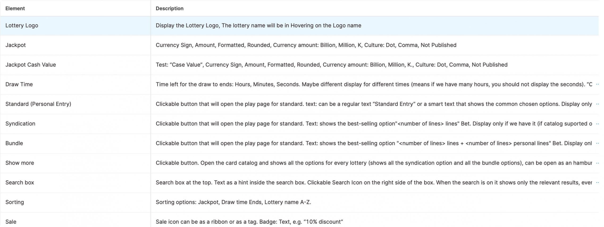
Fragments
The Product Owner of this project (Matan) defined important fragments of the game process to be included. I had to take these into account when starting the wireframes steps.
Interviews are a great way to empathize with our users and allow us to ask specific questions.
User interviews
After the kickoff meeting, I had all the relevant information from the product end, and I could start getting to know our users in detail.
In general, user interviews can be a great way to empathize with users and gain an in-depth understanding of their values, perceptions, and experiences. It also allows us to ask specific questions while remaining open to exploring our participants’ points of view and to discover what we are doing right and what we are doing wrong.
I believe this step is essential for balance between the product expectations and user needs. As part of this step, I listened to many hours of recordings and summarized all relevant information.
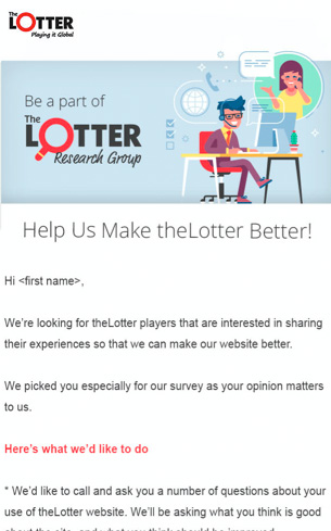
Recruitment Email
The Art Director of the company (Manoela) and I decided to create a recruitment email to send our users. The email asked users to help us improve our product by participating in a 30-minute interview.
In exchange, they received a $30 Bonus Money incentive. On average, interviews lasted an hour, as users were even more co-operative than we expected.
Insights
The customer support agents recorded all the interviews and forwarded them to me. I listened to many hours of recordings (16.5 hours, 10 interviews); summarized all important data; and divided the customers into two groups: males and females.
This division made it easier to map any common paint points that should be considered as high priority and see which paint points are related to any specific segment..
Segmentation & Personas
James Carter, 60 years old
Boston, MassachusettsRetired Dentist Living with his wife
- Playing mostly for fun, once a week.
- Doesn’t want to share winnings
- Would like to have flexibility in choosing amount of lines
- Finds the QuickPick very helpful, save him time, using it 1 out of 2 lines.
- Doesn’t understand the difference between multi-draw and subscription, therefore he’s not using it at all.
Chanice Leroy, 44 years old
Chicago, Illinois
Professional singer and dancer
Single mother of 2
- Purchasing online save her time.
- Doesn’t like our Bundles/Syndicates, wants to keep the winnings for herself.
- Wants the control of choosing more/less lines.
- Using the QuickPick for all the lines or average of 1 out of 2 lines.
- The price per line is not clear enough, it could be very unexpected.
Common pain points:
Flexibility – Want to stay in control.
Sharing – Keep all winning for myself.
QuickPick – In use 100% of the time (at least one time for a single purchase).
Specific segment pain points:
Save time – Online playing and QuickPick.
Terminology – Difference between syndicates and bundles.
Price – Not clear enough, emphasized it should be take into consideration.
It’s essential to see how users interact with our products so that we can gain insight into what works and what doesn’t work.
User testing
Who Was Tested?
I created very specific user flow and questions to identify our strong points and weak points with new users. The tests were run with usertesting.com.
Our customer support agents asked three existing users to participate in this test, in exchange for an additional $30 Bonus money. It was important for me to see how existing users interacted with the game. I wanted to see if there were significant differences between new users and existing users’ game interactions.
The Results
-
- It was very surprising to see that almost all the users, both new and existing hadn’t seen the bonus numbers, which are extremely important!
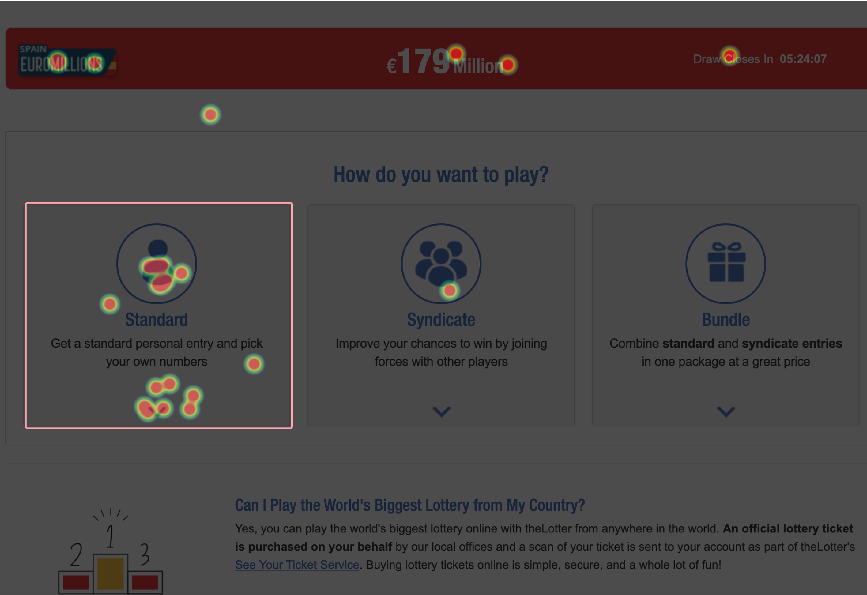
- It was also surprising to see that they clicked on the “PLAY NOW” button and no one chose to play with subscription or multi-draw. It seems that users ignore these options.
- The QuickPick button was used 90% of the time, overlapping with the information we got from the user interviews (average of 1 to 2 lines)
- No one chose to play syndicate/bundles. This confirmed the user interview feedback about users wanting to keep winnings.
It was acceptable to stop user testing at this point, as I had enough data… considering the time constraint I wanted to explore mouse tracking.
Mouse tracking
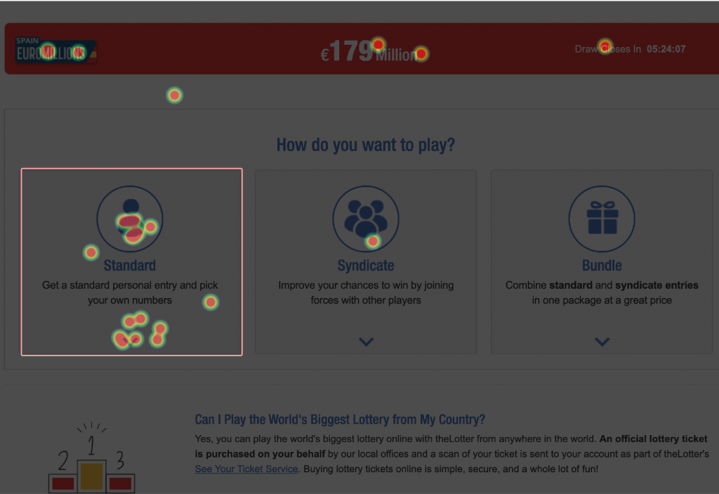
Mouse tracking is the only valid data visualization tool for us as ux designers. Now, you might say “You’re wrong, there is another visualization tool – heatmaps”. Right, there is, but with heatmaps, you can’t tell if the user is overwhelmed by data.
A heat map shows interest, but it does not show if the users are completely confused. Taking that into consideration, plus the time I had for the project, I wanted to invest in the last step, and examine our game page. Our game page had a lot of buttons and too many tooltips; even I got a little bit lost.
Here are the insights I got from analyzing the mouse tracking:
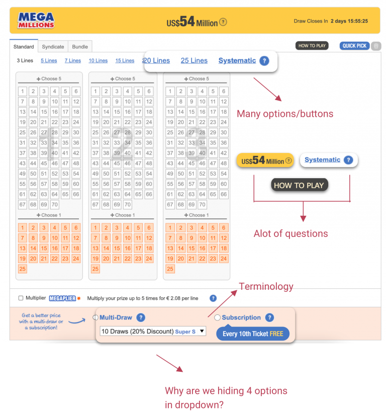
The Solution
Reduce cognitive load, by eliminating the number questions and buttons. Create a step-by-step game approach, a wizard with clear instructions.
Organize the data
Organize the data so that the user does not have a lot of unanswered questions (price, what to do next?), change the multi-draw and subscription terminology. Their logic is the same so they could be under the same category and not separated.
Be in control
2. Wireframes
The process from mapping the pages to low wireframes & prototype
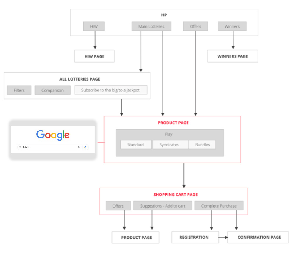
Site map & user journey
Prioritize the pages
So, the first step of the process was behind me, and I had all the important data summarized.
I mapped and organized all of the important pages to see the user journey on our website and to have a better understanding of how exactly the user can be redirected to the game page.
Key points
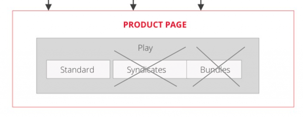
Together with the CTO of the company, it was decided to invest only in MVPs (this allows a team to collect the maximum amount of validated information about customers with the least effort).
It was clear that our users didn’t want to share their winnings, and this was also clear from the heatmap.
It was decided, together with the PO (Matan) to <focus only on the standard game for now and keep the syndicates & bundles for the second phase of our process.
Low wireframes & prototype
As this game has many screens, I would like to highlight a key screen.
Below is the main page. The user can be redirected to the main page from the site itself and unlike other screens in this game, the user can also be redirected to the main page from Google if they are searching for a specific lottery (as we found out from the user-journey mapping).
So, it’s extremely important to make sure that the user knows what to expect, gets enough information, and of course that we gain his confidence.
Goal: To provide clear information architecture, without the need for too many questions, and to gain the user’s trust
Decision making in 3 steps
How We Created This Prototype?
First draft
Firstly, I placed the main fragments in the hierarchy as I envisioned. It was basically just to get an idea of how I wanted to structure the page. After the important fragments were in place, I could continue to the next step – meeting with the PO to brainstorm, and then diving into more details.
Revision meeting
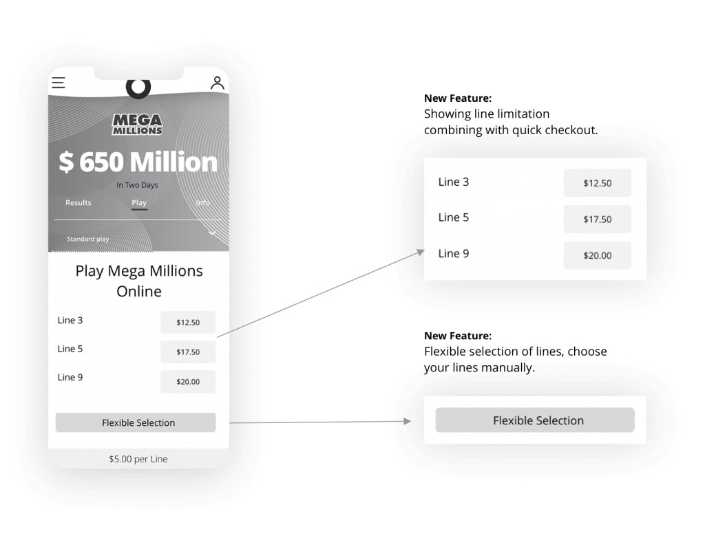
Let’s examinate the first page of the game. The PO shared his input with me and came up with the idea that maybe we could add a new feature – Quick Checkout button.
The feedback we received, mostly from the female group, showed that users don’t have a lot of time. By adding the Quick Checkout option we help them save even more time.
It doesn’t cost a lot from the MVP point of view, so why wouldn’t we improve the user experience?
01. We decided to put the official lottery logo at the top – the Lottery logo tells users it is an official game and promotes user trust. After that, the jackpot is the most important data on the page and it must be emphasized.
02. Here the user navigates to the different game options (standard, syndicate, bundles). We decided to remove the first step of choosing which option to play. And instead, the standard option is automatically selected.
03. Gain the users’ trust with a clear headline stating that they are playing with official Lottery tickets. The CTAs are placed at the bottom, close to the finger for easy and fast navigation.
04. The user would see the price at the bottom without the need to scroll.

Low fidelity prototype
We agreed on the final version of the wireframe. Then I was able to add some finishing touches, and “bring it to life” before presenting it to the relevant stakeholders for final approval.
Only then could I go into more detail and proceed with high fidelity wires and prototypes.

Stakeholders & final version
Stakeholders meeting
We presented the prototype at the stakeholders’ meeting, and the stakeholders’ reaction was generally good with just a little feedback:
- The quick checkout button got very positive feedback.
- The stakeholders liked the very clear and straightforward page message.
- Although I thought it would be good to use the flexible choice, I got feedback about the importance of still showing the lines limitation as with the original version, to boost the sales.
Final version
The PO and I met to try and solve the issues raised by the stakeholders’ feedback. This is the exact point where it is necessary to balance product and user experience. I enjoyed the challenge of trying to solve these issues.
I took the last wireframe and went into more detail, trying to solve the issues that raised by the stakeholders. I came up with the following solution:
- Combining the quick checkout feature together with the line limitation.
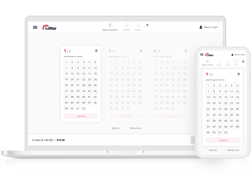
- Thanks to the solution above, we are able to keep the flexible selection. This feature would be very useful, I decided to place it on the bottom of the so it would be easy to target.
3. UI Design
Stand out from our competitors and be unique
Final UI
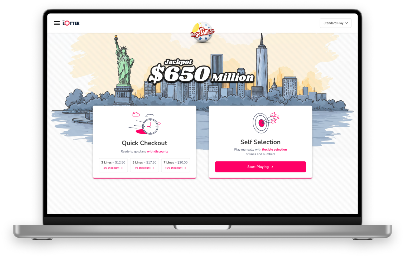
As mentioned above, I suggested creating an interesting look and feel, more like a travel website. Of course, I raised this suggestion with my team and we all agreed it was a very good and unique direction.
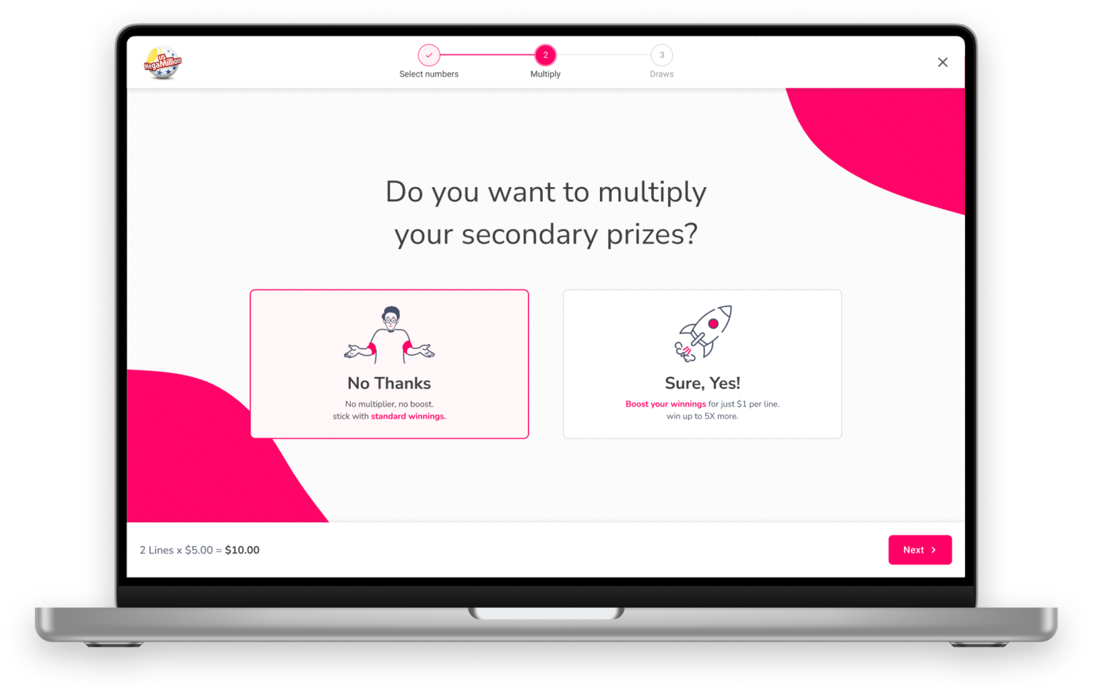
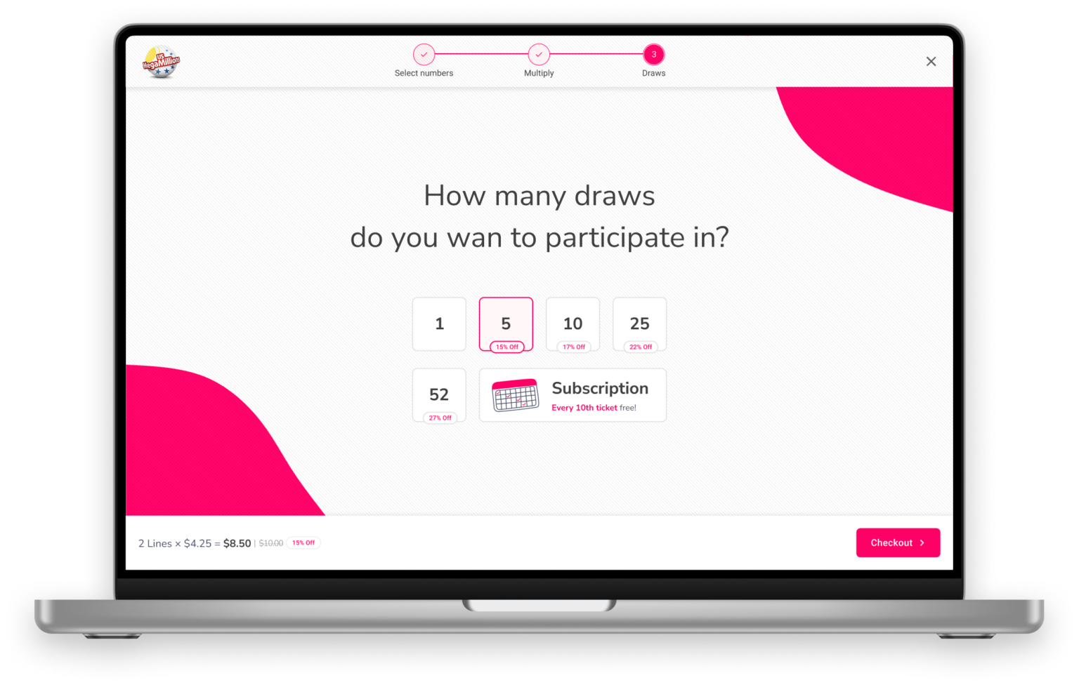
The main page would have a big hero image of the country / state the lottery is coming from. The play process would only include the wizard to keep the user moving straight forward without any distractions.
Let’s see some key screens and how it looks on Desktop and Mobile.
Illustration of a hero image featuring a famous landmark for a lottery
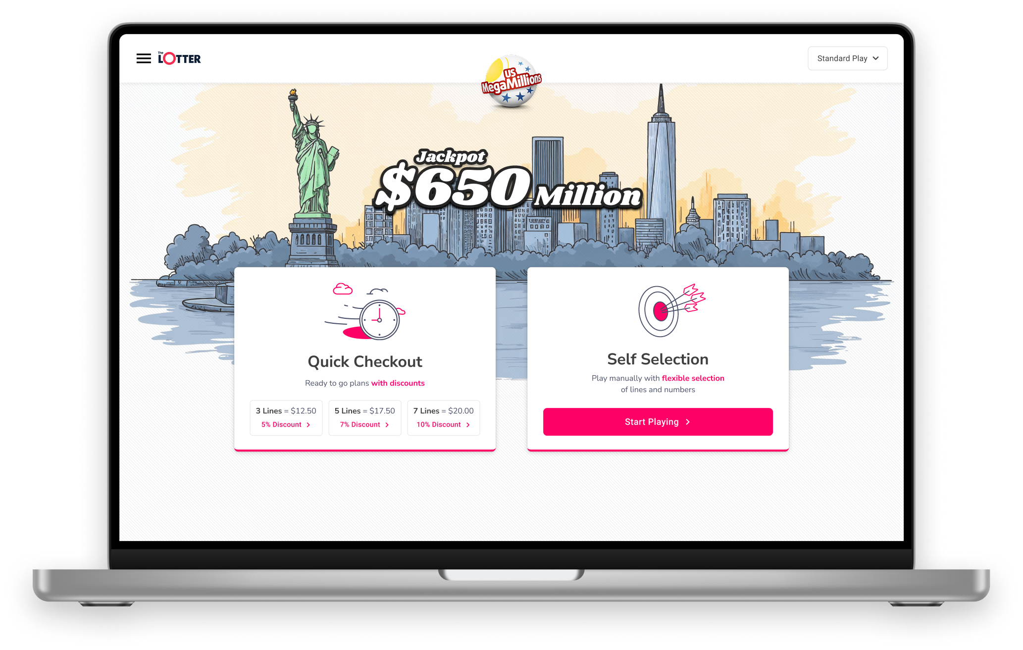
Use of modern illustration, combined with a sense of usability and accent colors
Wizard has a clean design to keep the user focused on the task without distruct him
Strong identity that stands out from our competitors
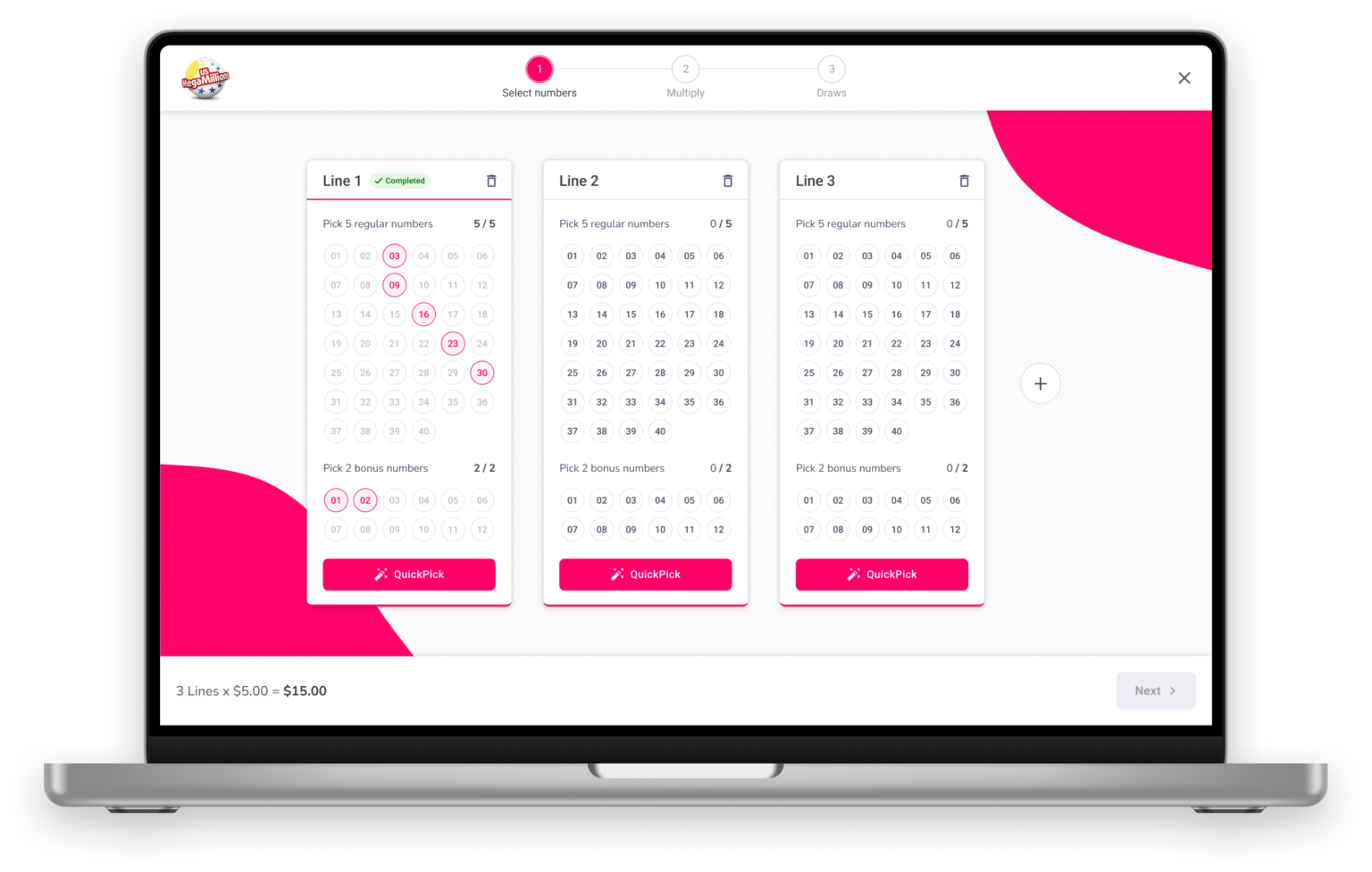
Final desktop prototype
Conclusion and final thoughts
I’m 100% confident that future results will show that our users are satisfied with these improvements, and the games will be much easier to understand and play. From the product point of view, I’m sure we will see more users upgrading their purchase with our unique multi-draw options as we, the company intended.
Unfortunately, the COVID-19 pandemic entered our lives, and the CEO of the company decided to postpone the launch date for now, until a later date, hopefully by the end of 2021.
- It was very challenging working from home most of the time and communicating with the team (PO, Art Director, and developers) but I think we did an excellent job and created an outstanding game experience.
- I’ve learned to be more flexible with my working hours, as some of the team members and I have young kids, and we often had to communicate in the evening when we all had more time to focus.
- It was great seeing how people cooperated, and how they were willing to help us improve the product. This is not something that is taken for granted.
- Zoom/Skype were very accessible so I talked with the PO and developers much more than I did before. In fact, I think it’s even improved my communication with them.
Previous Case Study
Next Case Study
Web Application • Duration: Sep’2020-Apr’2021
Lottery Game Process
- Research
- User testing
- Wireframes
- Prototype
- UX / UI Design
theLotter is a worldwide online ticket purchasing service, providing customers with the opportunity to play the biggest lottery draws. The site undertook a web redesign, and I had the opportunity to improve the company’s main product (lottery games).
Challenge
- To simplify the game process which had multiple play options, different packages, and too much information.
- Convince more people to increase their purchase with our multiplier feature, and get them to upgrade to multi-draw / subscription games.
- A large part of this project happened during the COVID-19 crisis, which made it even more challenging to communicate with all relevant remote teams.
Teams
I worked in collaboration with the Product Owner (PO), Customer Support Agents, developers, CTO, Retention Manager, and my teammates.
4 Steps Process


We initiated the process by aligning the product team with the various requirements.
Kickoff meeting
The Product Owner, Art Director, product designers, and Head of Product attended the kickoff meeting. The goals of the meeting were to finalize which fragments go on each page and to define a measurable objective for this process.
Obectives
Fragments
The Product Owner of this project (Matan) defined important fragments of the game process to be included. I had to take these into account when starting the wireframes steps.

Interviews are a great way to empathize with our users and allow us to ask specific questions.
User interviews
After the kickoff meeting, I had all the relevant information from the product end, and I could start getting to know our users in detail.
In general, user interviews can be a great way to empathize with users and gain an in-depth understanding of their values, perceptions, and experiences. It also allows us to ask specific questions while remaining open to exploring our participants’ points of view and to discover what we are doing right and what we are doing wrong.
I believe this step is essential for balance between the product expectations and user needs. As part of this step, I listened to many hours of recordings and summarized all relevant information.
Recruitment Email
The Art Director of the company (Manoela) and I decided to create a recruitment email to send our users. The email asked users to help us improve our product by participating in a 30-minute interview.
In exchange, they received a $30 Bonus Money incentive. On average, interviews lasted an hour, as users were even more co-operative than we expected.
Insights
The customer support agents recorded all the interviews and forwarded them to me. I listened to many hours of recordings (16.5 hours, 11 interviews); summarized all important data; and divided the customers into two groups: males and females.
This division made it easier to map any common paint points that should be considered as high priority and see which paint points are related to any specific segment..

Segmentation
3 Churn users
3 Soft Gamers
4 VIP users
James Carter, 60 years old
Boston, Massachusetts Retired Dentist Living, with his wife- Playing mostly for fun, once a week.
- Doesn’t want to share winnings
- Would like to have flexibility in choosing amount of lines
- Finds the QuickPick very helpful, save him time, using it 1 out of 2 lines.
- Doesn’t understand the difference between multi-draw and subscription, therefore he’s not using it at all.
Chanice Leroy, 44 years old
Chicago, Illinois
Professional singer and dancer
Single mother of 2
- Purchasing online save her time.
- Doesn’t like our Bundles/Syndicates, wants to keep the winnings for herself.
- Wants the control of choosing more/less lines.
- Using the QuickPick for all the lines or average of 1 out of 2 lines.
- The price per line is not clear enough, it could be very unexpected.
Common pain points
Flexibility – Want to stay in control.
Sharing – Keep all winning for myself.
QuickPick – In use 100% of the time (at least one time for a single purchase).
Specific pain points
Save time -Online playing and QuickPick.
Terminology – Difference between syndicates and bundles.
Price – Not clear enough, emphasized it should be take into consideration.
It’s essential to see how users interact with our products so that we can gain insight into what works and what doesn’t work.
User testing
Who Was Tested?
5 Users Who Were Not Familiar with Our Game
I created very specific user flow and questions to identify our strong points and weak points with new users. The tests were run with usertesting.com.
5 Existing Users
Our customer support agents asked three existing users to participate in this test, in exchange for an additional $30 Bonus money. It was important for me to see how existing users interacted with the game. I wanted to see if there were significant differences between new users and existing users’ game interactions.
The Results
- It was very surprising to see that almost all the users, both new and existing hadn’t seen the bonus numbers, which are extremely important!
- It was also surprising to see that they clicked on the “PLAY NOW” button and no one chose to play with subscription or multi-draw. It seems that users ignore these options.
- The QuickPick button was used 100% of the time, overlapping with the information we got from the user interviews (average of 1 to 3 lines)
- Three out of 3 existing users chose to play standard without hesitating. No one chose to play syndicate/bundles. This confirmed the user interview feedback about users wanting to keep winnings.
It was acceptable to stop user testing at this point, as I had enough data… considering the time constraint I wanted to explore mouse tracking.
Mouse tracking
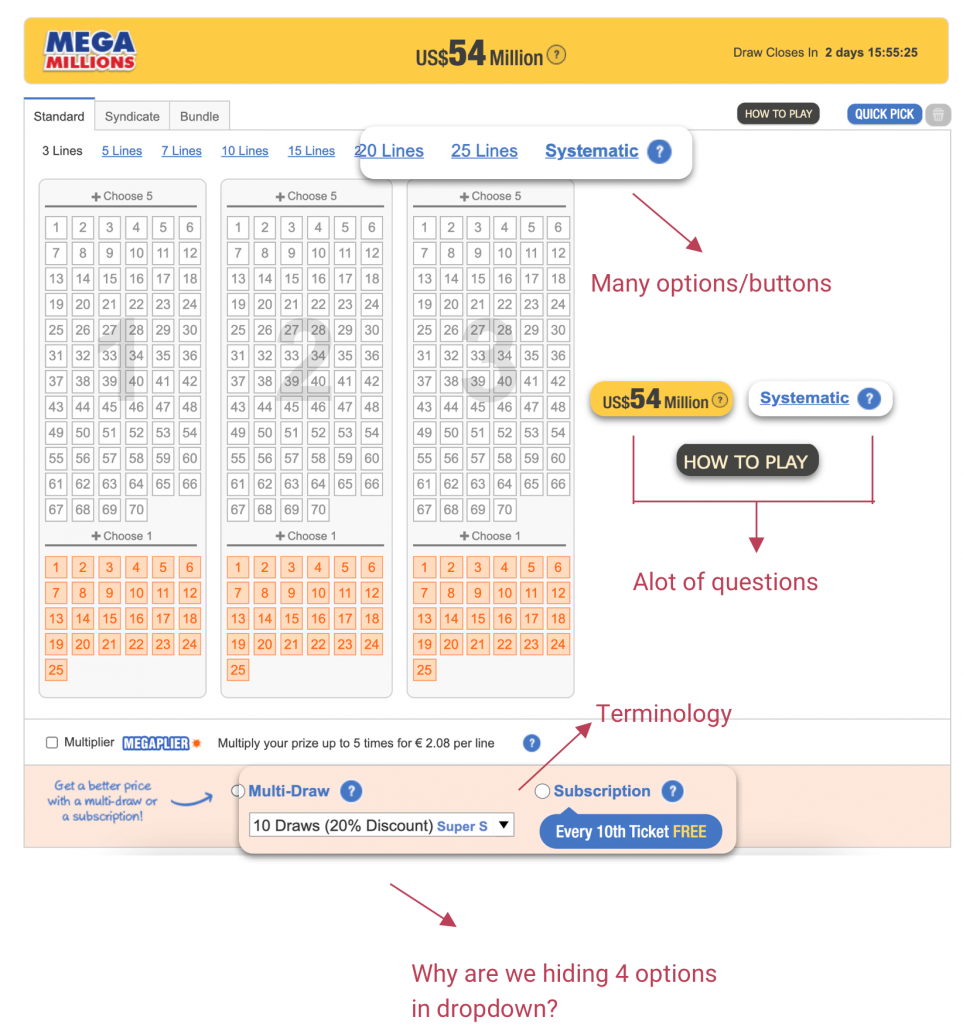
Mouse tracking is the only valid data visualization tool for us as UX designers. Now, you might say “You’re wrong, there is another visualization tool – heat maps”. Right, there is, but with heat maps, you can’t tell if the user is overwhelmed by data. A heat map shows interest, but it does not show if the users are completely confused. Taking that into consideration, plus the time I had for the project, I wanted to invest in the last step, and examine our game page. Our game page had a lot of buttons and too many tooltips; even I got a little bit lost. Here are the insights I got from analyzing the mouse tracking:
The Solution
Cognitive load
Reduce cognitive load, by eliminating the number of lines to choose from. Create a step-by-step game approach, like a wizard with clear instructions.
Organize the data
Reduce cognitive load, by eliminating the number of lines to choose from. Create a step-by-step game approach, like a wizard with clear instructions.
Be in control
Give the user control of choosing how many lines they play, but without overwhelming the user with too many options. Emphasize the bonus numbers so the user won’t have any surprises at the end of the process.
Site map / user journey
Prioritize The Pages
So, the first step of the process was behind me, and I had all the important data summarized. I mapped and organized all of the important pages to see the user journey on our website and to have a better understanding of how exactly the user can be redirected to the game page.

Key Points
Together with the CTO of the company, it was decided to invest only in MVPs (this allows a team to collect the maximum amount of validated information about customers with the least effort).
It was clear that our users didn’t want to share their winnings, and this was also clear from the heat map.
It was decided, together with the PO (Matan) to to focus only on the standard game for now and keep the syndicates & bundles for the second phase of our process.
Low wireframes & prototypes
As this game has many screens, I would like to highlight a key screen. Below is the main page. The user can be redirected to the main page from the site itself and unlike other screens in this game, the user can also be redirected to the main page from Google if they are searching for a specific lottery (as we found out from the user-journey mapping). So, it’s extremely important to make sure that the user knows what to expect, gets enough information, and of course that we gain his confidence.
Goal: To provide clear information architecture, without the need for too many questions, and to gain the user’s trust
Decision making in 3 steps
How We Created This Prototype?
First draft
Firstly, I placed the main fragments in the hierarchy as I envisioned. It was basically just to get an idea of how I wanted to structure the page. After the important fragments were in place, I could continue to the next step – meeting with the PO to brainstorm, and then diving into more details.
Revision meeting
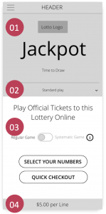
Let’s examinate the first page of the game. The PO shared his input with me and came up with the idea that maybe we could add a new feature – Quick Checkout button. The feedback we received, mostly from the female group, showed that users don’t have a lot of time. By adding the Quick Checkout option we help them save even more time. It doesn’t cost a lot from the MVP point of view, so why wouldn’t we improve the user experience?
01. We decided to put the official lottery logo at the top – the Lottery logo tells users it is an official game and promotes user trust. After that, the jackpot is the most important data on the page and it must be emphasized.
02. Here the user navigates to the different game options (standard, syndicate, bundles). We decided to remove the first step of choosing which option to play. And instead, the standard option is automatically selected.
03. Gain the users’ trust with a clear headline stating that they are playing with official Lottery tickets. The CTAs are placed at the bottom, close to the finger for easy and fast navigation.
04. The user would see the price at the bottom without the need to scroll..
From low fidelity prototype to high fidelity wireframes
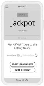
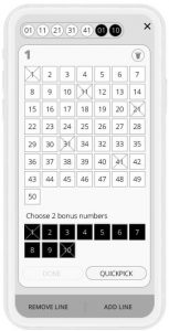
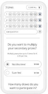
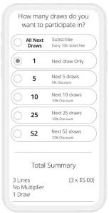
We agreed on the final version of the wireframe. Then I was able to add some finishing touches, and “bring it to life” before presenting it to the relevant stakeholders for final approval. Only then could I go into more detail and proceed with high fidelity wires and prototypes.
Stakeholders & final version
Stakeholders meeting
We presented the prototype at the stakeholders’ meeting, and the stakeholders’ reaction was generally good with just a little feedback:
- The quick checkout button got very positive feedback.
- The stakeholders liked the very clear and straightforward page message.
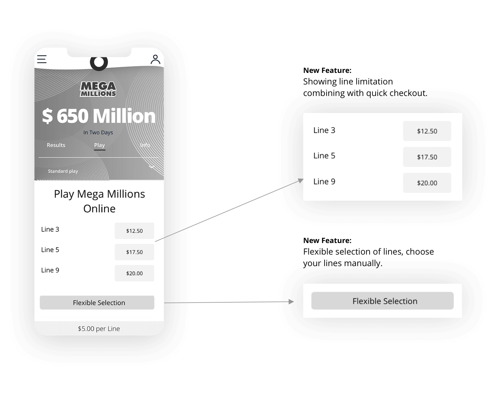
- Although I thought it would be good to use the flexible choice, I got feedback about the importance of still showing the lines limitation as with the original version, to boost the sales.
Final version
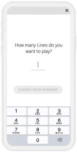
The PO and I met to try and solve the issues raised by the stakeholders’ feedback. This is the exact point where it is necessary to balance product and user experience. I enjoyed the challenge of trying to solve these issues. I took the last wireframe and went into more detail, trying to solve the issues that raised by the stakeholders. I came up with the following solution:
- Combining the quick checkout feature together with the line limitation.
- Thanks to the solution above, we are able to keep the flexible selection. This feature would be very useful, I decided to place it on the bottom of the so it would be easy to target.
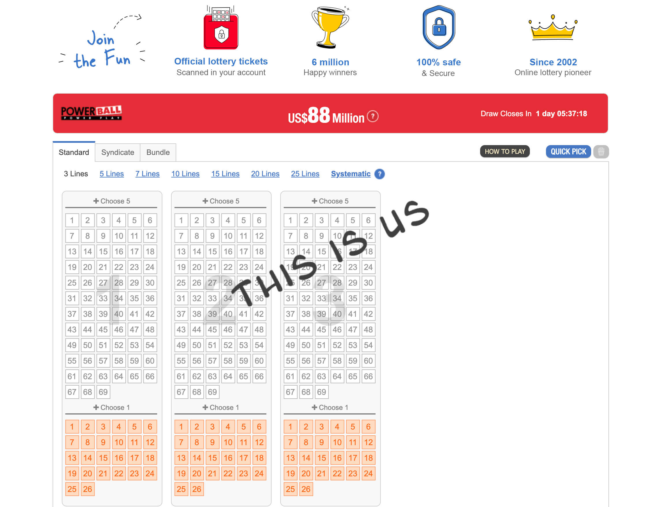
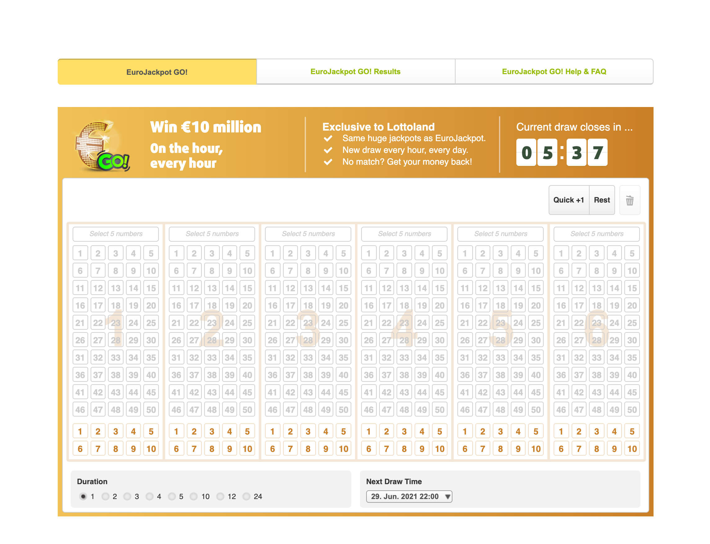
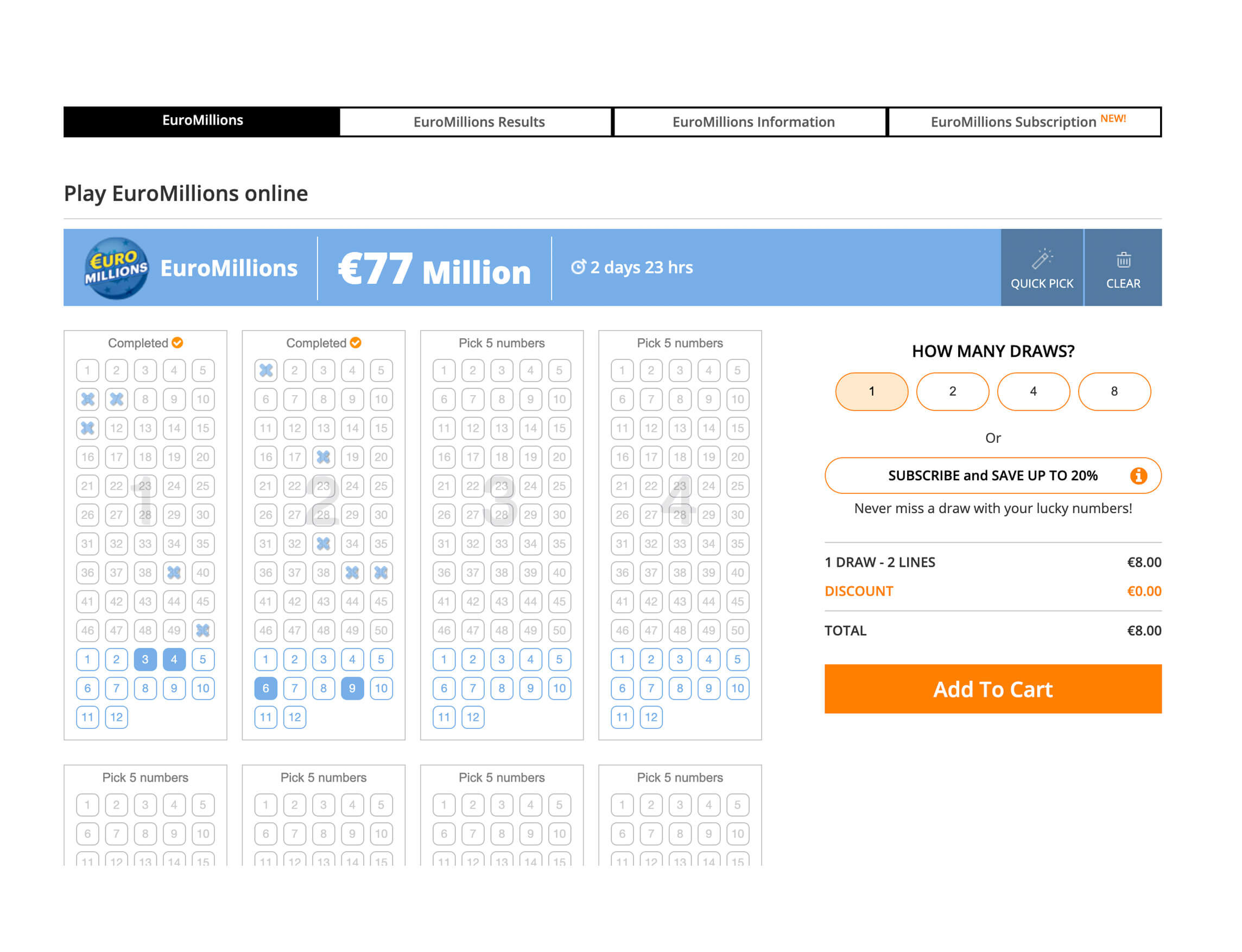
B*tch stole my look
All the competitors (including us) are having the same look and feel. To make our brand memorable and stand out, I suggested changing the look and feel of the lottery page and cards to be more like a travel website.
I believe users will engage more with real photos of places around the world and will make the connection between the city and the lottery.
Final UI
All the competitors (including us) are having the same look and feel. To make our brand memorable and stand out, I suggested changing the look and feel of the lottery page and cards to be more like a travel website.
I believe users will engage more with real photos of places around the world and will make the connection between the city and the lottery.
Hero image of a famous landmark for each lottery
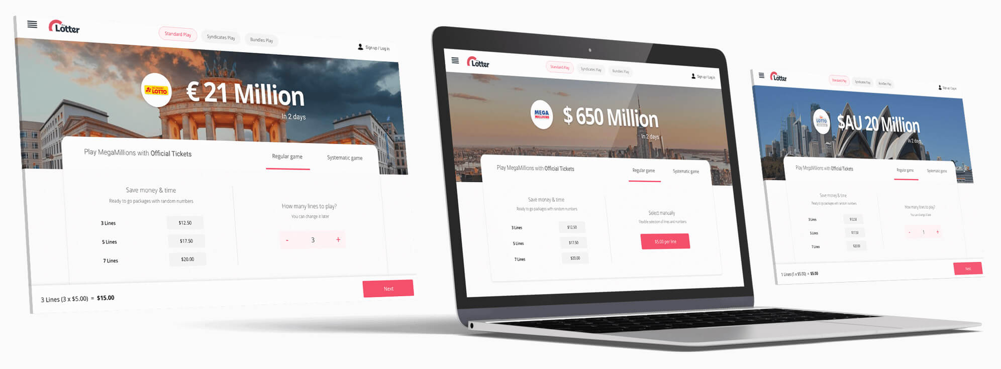
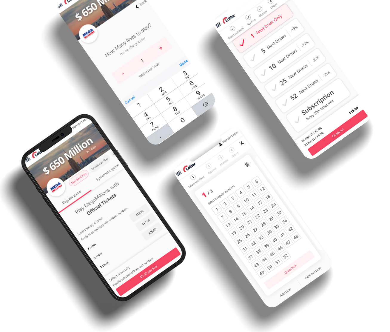
Strong but yet a pleasant color, great fit to our brand’s logo
Wizard have a clean design to keep the user focus on the task without distruct his attention
Strong identity and standing out from our competitors
After this long and fun journey I had the pleasure to create the final prototypes
Conclusion
I’m 100% confident that future results will show that our users are satisfied with these improvements, and the games will be much easier to understand and play. From the product point of view, I’m sure we will see more users upgrading their purchase with our unique multi-draw options as we, the company intended.
Unfortunately, the COVID-19 pandemic entered our lives, and the CEO of the company decided to postpone the launch date for now, until a later date, hopefully by the end of 2021.
- It was very challenging working from home most of the time and communicating with the team (PO, Art Director, and developers) but I think we did an excellent job and created an outstanding game experience.
- I’ve learned to be more flexible with my working hours, as some of the team members and I have young kids, and we often had to communicate in the evening when we all had more time to focus.
- It was great seeing how people cooperated, and how they were willing to help us improve the product. This is not something that is taken for granted.
- Zoom/Skype were very accessible so I talked with the PO and developers much more than I did before. In fact, I think it’s even improved my communication with them.
Next Case Study
Tamir Schwarz – UX Designer | +972-54-799-5440 | Hope to hear soon 😋

