Duration: Sep 2024 -Jan 2025 (5 months)
Data & Closure via Dashboard
- Research - interviews, usability testing
- UX/UI Design
- Prototype
- Information Architecture
OVERVIEW
At Bright Security, we empower developers and AppSec teams with DAST solutions. However, a critical gap in the platform was the lack of a centralized dashboard to provide an overview of vulnerability data. Customers consistently reported that without such a feature, they struggled to identify and prioritize vulnerabilities, track entry points, and gauge the platform's overall security health. The goal was to design a dashboard that streamlined critical security data, enabling users to quickly identify vulnerabilities, assess trends, and make informed decisions.
TIMELINE
MVP Development: 2 months (See screenshot).
Refinements and Iteration: Completed over the next 3 months based on user feedback and insights.
Total Duration: 5 months (See screenshot).
PROBLEM STATEMENT
PROCESS
1. Identifying user needs
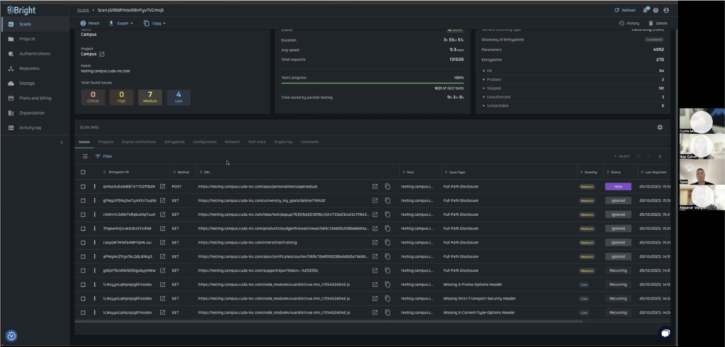
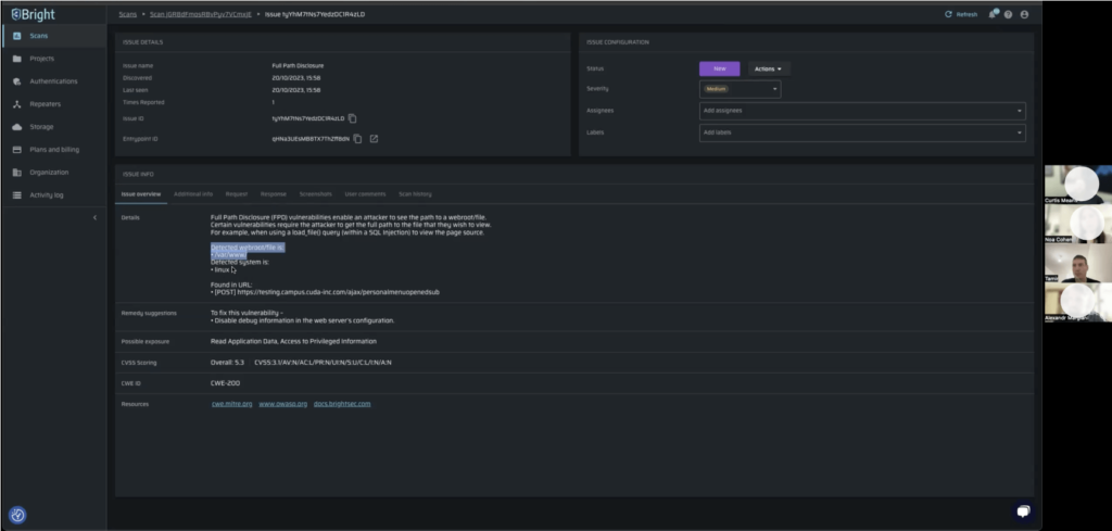
The Product Manager of this project (Noa) and I initiated this process by interviewing developers and AppSec professionals to uncover their pain points and priorities. I led the research effort, asking open-ended questions to guide the discovery process and shape the dashboard’s design:
Screenshot of the interview process

2. Designing information architecture based on user insights
The feedback led me to focus on 3 core elements:
current vulnerabilities, vulnerabilities over time, and overall security health.
Based on the research, I made the following design decisions for each of the key tiles:
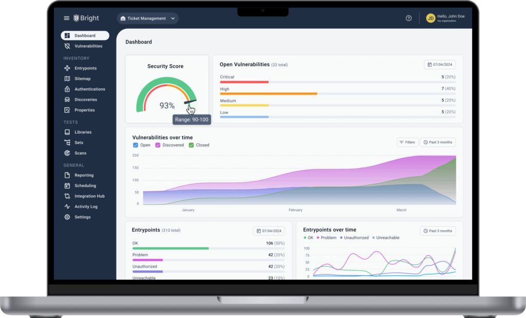
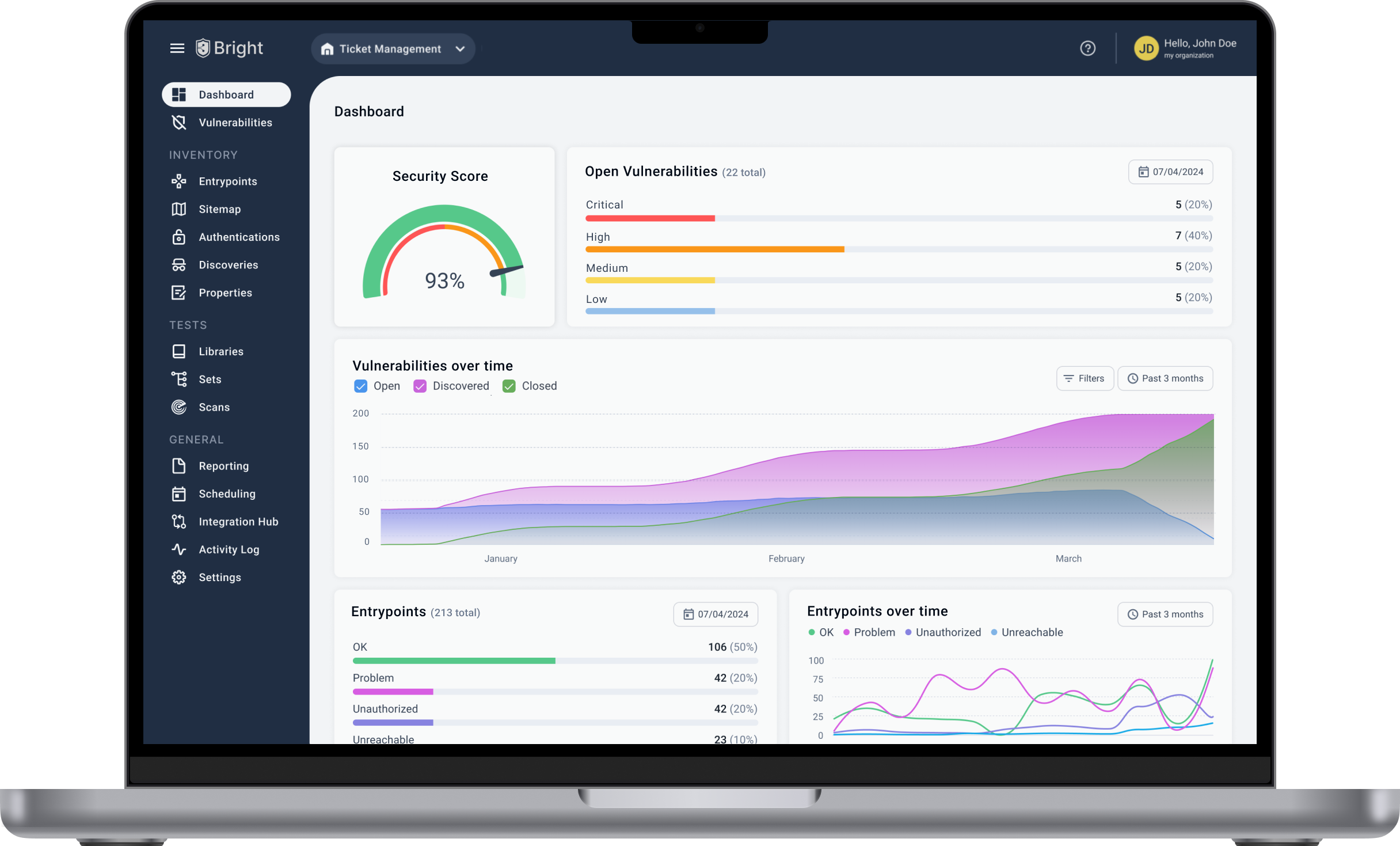
1. Security score gauge
A 0-100% score with red, orange, and green colors to quickly indicate security health. Users needed a clear, at-a-glance view of system status. The goal was to design a dashboard that streamlined critical security data, enabling users to quickly identify vulnerabilities, assess trends, and make informed decisions.

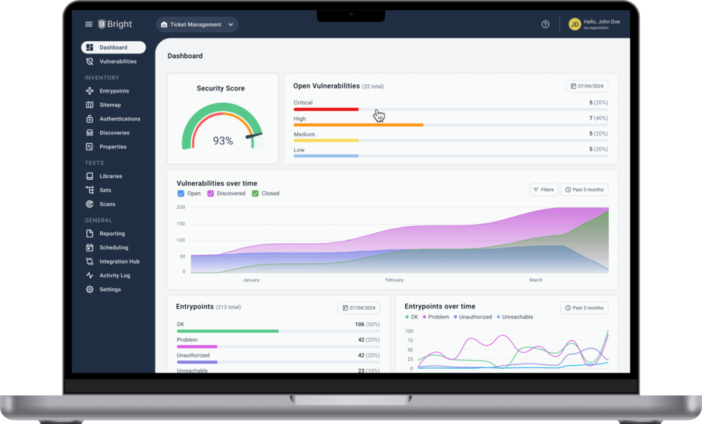
2. Open vulnerabilities
Horizontal bar charts show severity breakdown (Critical, High, Medium, Low) to make it easy to prioritize vulnerabilities based on urgency.

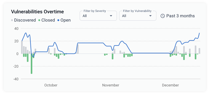
3. Vulnerabilities overtime
A full-width timeline chart to track how vulnerabilities evolve over time, helping users spot patterns and trends.
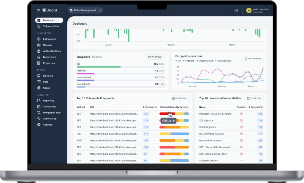
- Entrypoints: A horizontal bar chart displaying entrypoints by status.
- Entrypoints overtime: A smaller timeline chart tracking entrypoints over time.
- Top 5 Vulnerable Entrypoints: A table listing the most critical entrypoints for immediate attention
- Top 5 Open Vulnerabilities: A table listing the top 5 open vulnerabilities based on severity.
3. Transitioning from Information Architecture (IA) structure to high-fidelity design
Building on the information architecture, I created high-fidelity designs focused on clarity, functionality. Using a 12px grid system, I ensured the dashboard was fully responsive for seamless use across devices. (See IA structure).
Key iterations included:
- Refining the Security Score Gauge for better clarity and user interaction.
- Adding distinct color contrasts in the Open Vulnerabilities chart to make severity levels visually distinct.
- Expanding the Vulnerabilities Over Time timeline to make trends easier to analyze.
I collaborated closely with developers to validate technical feasibility and ensure a smooth transition from concept to implementation.
Old flow
- Enter the Scans page
- Filter by severity
- Click on apply filter button
- Sort by "Health" column
- Click on a record
- Navigate to the entrypoints tab
- Filter by open vulnerabilities
- View filtered entry points table
- Sort by "Health" column
- Click on an entrypoint record
- Details page
Time Analysis: This flow took an average of 3 minutes and 30 seconds for 5 tested users (existing users familiar with the platform) to navigate from platform login to identifying critical open vulnerabilities.
New flow
- Land on the Dashboard page
- Click on the Open Vulnerabilities bar
- Click on an entrypoint record
- Details page
Time Analysis: The new flow reduced the average time to 1 minute for users to access critical open vulnerabilities, view details, and suggest actions.
New flow improved the process efficiency by over 70%!!
UX CHALLENGES AND SOLUTIONS
After testing with 5 users, we launched the MVP dashboard to all users. During further usability testing, I identified key improvements to enhance the UX:
Bar charts & Percentage data
The original bar chart was hard to use because low-severity bars were nearly invisible. I updated the bars to stretch across the full width of the tile, ensuring that users could always click on them. The bars are now color-coded (critical, high, medium, low) over a grey background to improve visibility and interaction.
Adding percentages alongside the vulnerability counts made it easier for stakeholders to quickly assess the severity distribution. Percentages help them see the relative impact of each category, making it simpler to prioritize remediation efforts.


Enhancing Data Visualization for Better Insights
The previous bar chart with a timeline made it difficult to analyze trends due to visual noise. I replaced it with a stacked area chart, providing a clearer, more intuitive view of vulnerabilities over time. Users found it easier to track patterns, making the dashboard more insightful and user-friendly.


Our fully interactive bars and tables let users click, explore, and resolve issues, ensuring a seamless, closure-driven UX
OUTCOME
The new dashboard resulted in substantial improvements:
- 70% Faster Task Completion: Users completed tasks (from platform entry to viewing critical vulnerabilities) in just 1 minute, significantly reducing the time spent compared to 3.5 minutes in the previous flow.
- Increased Engagement: The dashboard became one of the most visited pages, with a significant increase in user interaction after launch.
- Customer Satisfaction: Users reported higher satisfaction, citing the new dashboard's clarity and efficiency in decision-making.
New full-page dashboard design

